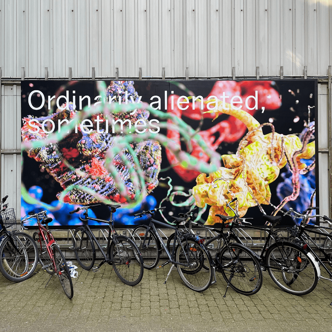
As a continuing series we are inviting designers and visual artists from around the world to contribute designs for our courtyard billboard. No creative restrictions – simply a format and a typeface.
For the eighth contribution to our TypePlay series we are super happy to feature visual artist Caroline Vang.

Carolines take on the TypePlay billboard is typed in Du Nord by PLAYTYPE. We are so thrilled to see Caroline’s work in this scale! We love how the billboard plays with contrasts and how it plays with a 3D illusion. It almost creates a glimpse into another dimension straight from our courtyard.
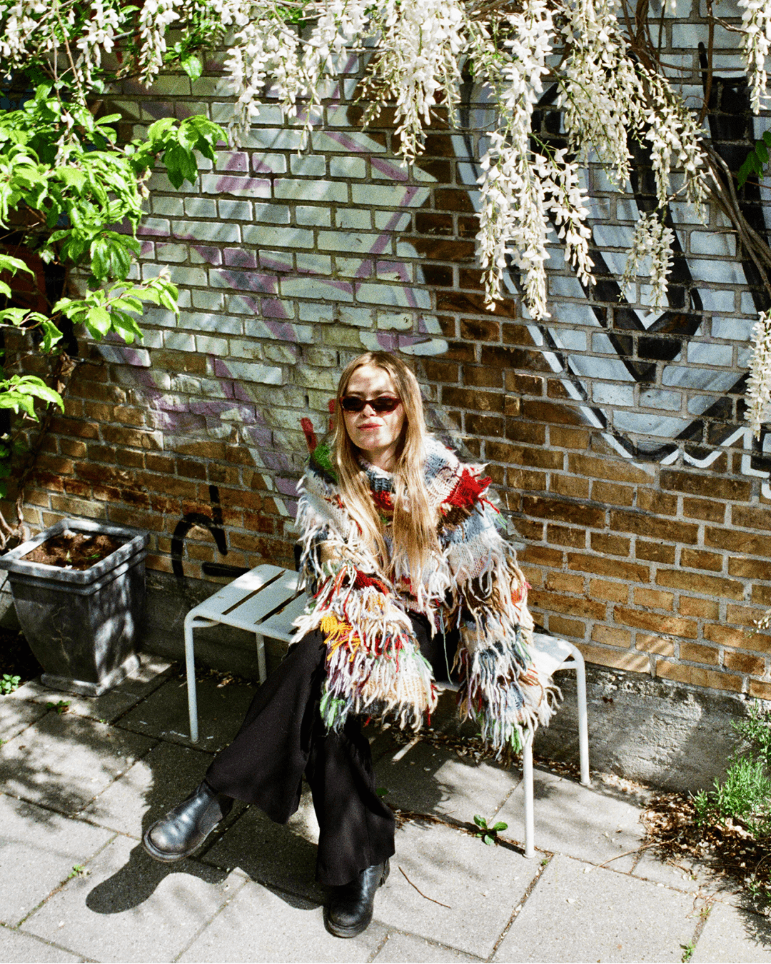
We’ve been following Caroline and her work for a while. We’re definitely fans of her work and the universe that evolved from it. We were curious to learn more about her and her process.
We caught up with Caroline for a small interview:
When and how did you first establish an interest in design? A specific memory or story?
I like to tell myself that the moment I started math on a higher level in high school, was the moment I was sure that I wanted to do something within the creative field, haha. That is of course not the whole story, but as a child, my dream was to become a flower arranger or fashion designer, so in that way, it has always been about aesthetics and creating.
Do you come from a family of creatives?
My older brother and I grew up drawing a lot with my grandmother who is an exceptionally good drawer. We could draw for hours and hours, and build up imaginary and often hilarious stories for each drawing. Today both of us work in the creative industry, my brother as an interior car designer.
What sparked your interest in 3D work?
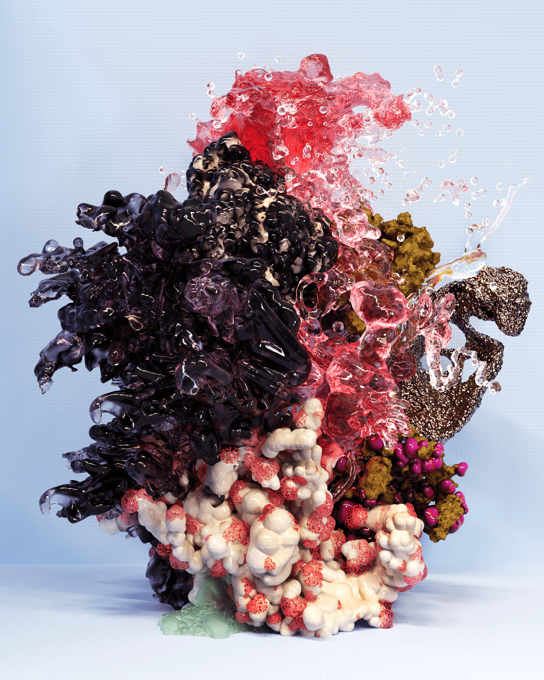
When I first started studying Graphic Design, I had no idea about CGI and 3D. I remember a course in the first year of my BA called “Experiment, Form & Material”, a very open course, free to investigate whatever was on your mind. I was lacking a sense of physicality in the field of Graphic Design and was envying the way the students at ceramic, spatial or textile design were working way more tangible. This might sound a bit ironic, as I have never been sitting as much behind a screen as I do now, but working with 3D gives me the possibility to work with imagery in an extremely tactile way.
Your artworks evolves primarily around abstract 3D renderings that appears to be out of this world. What inspires these shapes and forms?
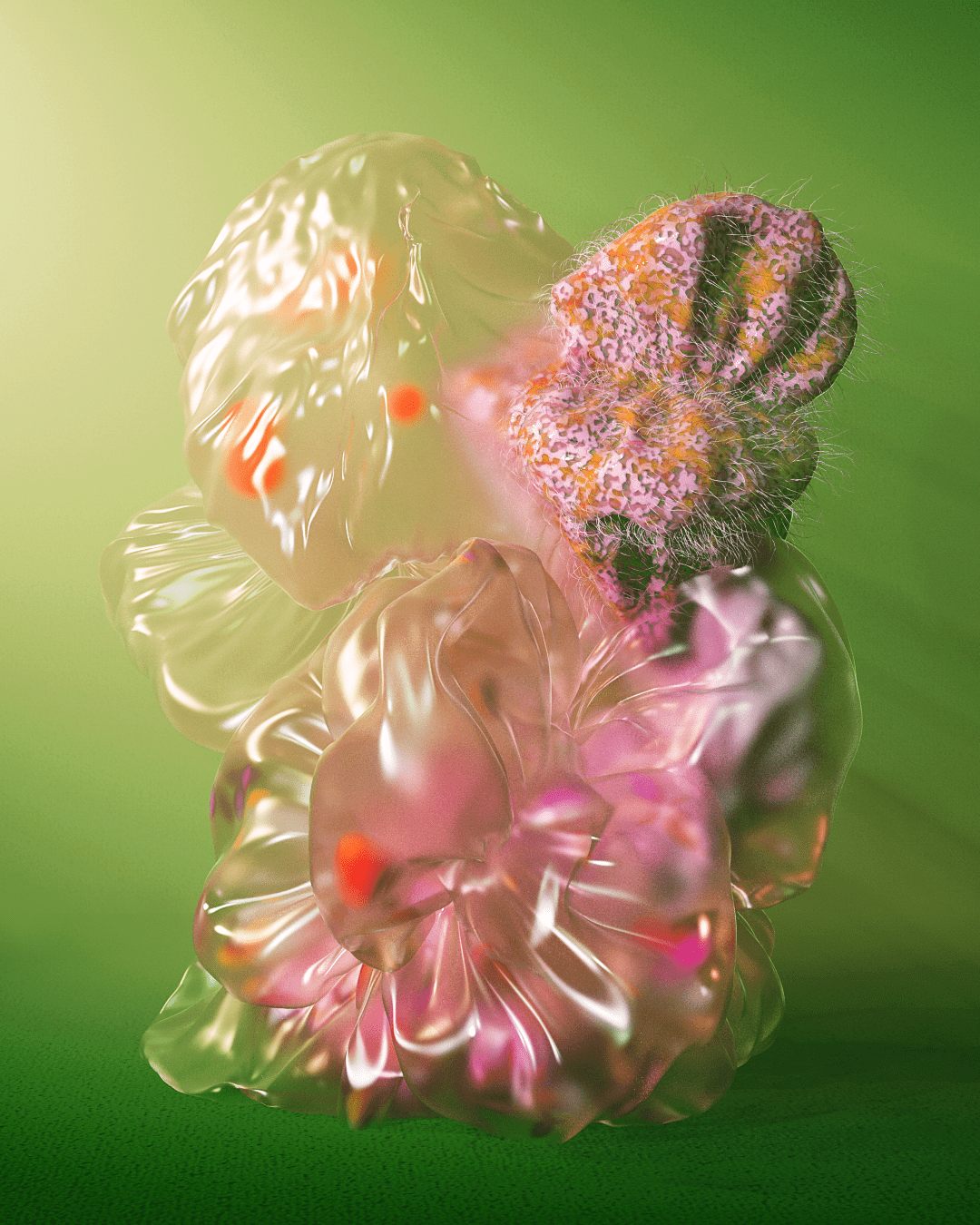
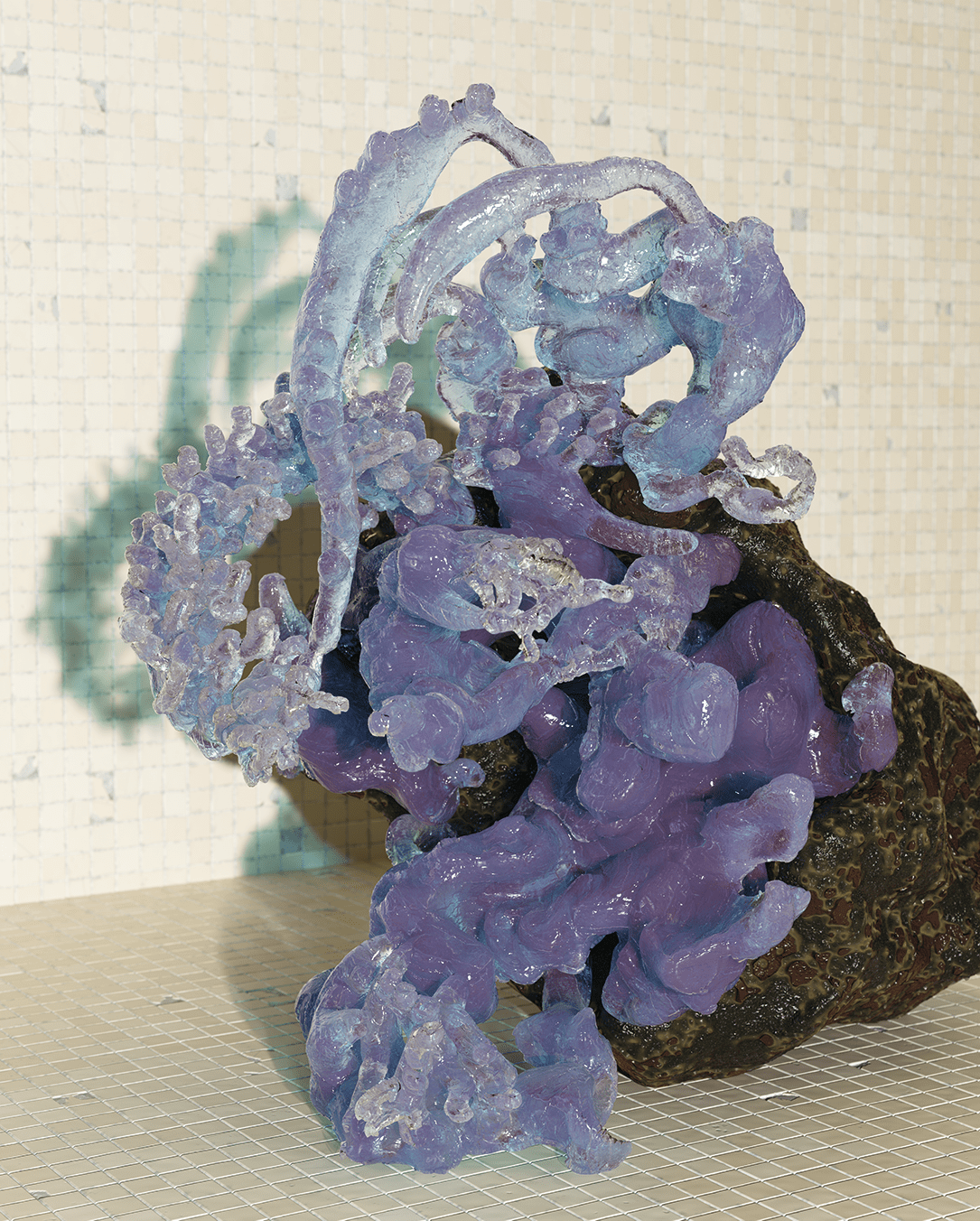
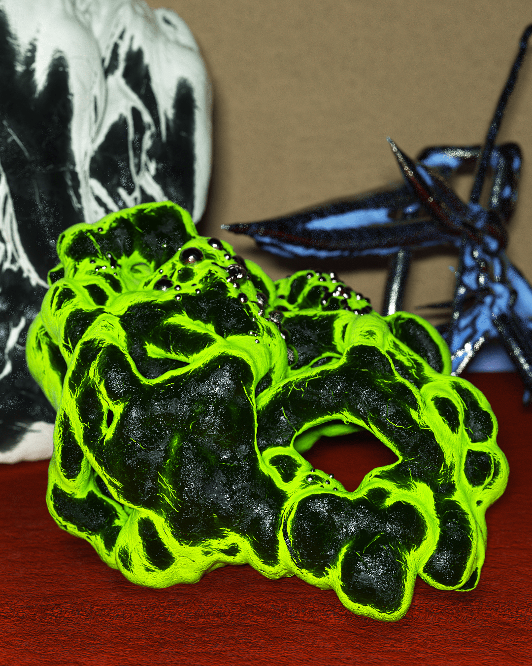
I enjoy working within the fine line of something that looks completely alien, but with an organic or realistic feel to it. Details, forms or textures that relate to things you know, but in a new shape, context, scene, etc.
Practically, my camera roll on my phone is a funky combination of everyday photos mixed with closeups from swamps, rotten food, damaged and cracked surfaces, useless objects found at flea markets, etc… I like to take inspiration from real life and merge elements into something surreal, yet hinting something familiar.
What is the typical process from the initial thought to the final artwork?
There is no specific path that I turn to, as it often depends on the brief or project. In general, I like to experiment and see where a small thought can bring me, regardless if it is a thought or vision of a specific material, scene, color, or general mood that I want to explore.
When working on personal projects, I enjoy working from my intuition. The image will change its’ mood every other second when playing with lights, form, and textures, which I will keep tweaking over and over until I feel like the right image is there.
Do you see any leading trends or exciting tendencies within contemporary graphic design?
In Scandinavia, we are known for our simplicity and minimalism. Our surroundings are full of shiny glass and metal, with strict lines and perfectly rounded shapes.
I think today’s contemporary designers are more likely to pop the grid and be less faithful to the “less is more” -philosophy. Let’s go!
How do you see your own work in the context of a larger contemporary designscape?
I would like to see my work contributing to a more visually diverse and vibrant field, focusing on experimental digital tangibility.
You’re working as both a graphic designer and a visual artist. Do you feel there’s a distinction between the two fields of practice and how would you describe it?
During my MA in Graphic Communication Design, insisting on using 3D as a software and communication tool, I have had some long conversations with professors, about whether I belong in a design or art institution. The distinction between art and design is a complex discussion, but from where I stand today I do not feel a need to put myself into one box or another, as I enjoy working in both fields and the blurriness in between.
You have been living and working various places in the world such as Berlin and Copenhagen. How do you see your surroundings and environment influence your artistic output?
It is complex to point to specific places that had directly influenced how I work today, but after finishing my BA in Visual Communication Design I moved to Berlin where the 3D scene is still much bigger and plays a greater role within graphic design. The vibrant design and art scene in Berlin have definitely influenced me, as well as the overwhelming nature of Reykjavik where I stayed for a semester during my BA.
Today I work from my little shared studio space in Copenhagen, with four other talented and inspiring creatives, and I could not be happier about my current surroundings.
Are you doing any side-projects or hobbies besides your work as a designer and artist?
During the lockdown, I, like the rest of Copenhagen, started knitting. Since I have never knitted before, I don’t know the “rules”. Generally don’t like to follow recipes regardless if it is for cooking or knitting, and I am convinced that this kind of “laziness” is a strength (not always when it comes to cooking), as it forces you to find new ways around.
What role does typography and typefaces have in your artistic output?
As a graphic designer, typography and typefaces obviously play a big role when designing, but to be honest, up until now, typography hasn’t played the main role in my work within 3D. That being said, I think the interaction between something flat and something dimensional can be super interesting and add to the surreal feel, that I often work within. This is something I definitely want to explore more in the future.
If you could only use one typeface for the rest of your life?
Argh! That’s uncomfortable. Helvetica Neue, basic like that.
How would you like people to perceive your work?
I always try aiming for making something that talks a tangible visual language. Something that makes you wonder how it would be to experience through all of our senses; What does it feel like, smell like, sound like… Something you are both intrigued and scared to watch come to life.
Thanks to Caroline Vang for participating in our TypePlay series, we are excited to see where your work takes you!
About
Caroline Vang (1995), is a Copenhagen based visual artist working in the fields of 3D and Graphic Design.
Beside finishing her master in Graphic Communication Design at The Royal Academy, Caroline works as a freelance visual artist, from her studio space in Copenhagen. Finding her inspiration from the most alien and quirky parts of nature.
Lacking a sense of physicality and tactility in the field of graphic design, 3D allows her to work with imagery in an extremely tactile way. Specializing in an experimental and surreal play of textures and shape, challenging the line between fiction and hyper reality.