Back in 2002 a new Danish newspaper called DAGEN saw the light of day. It was the first one launched in Denmark for almost 50 years. It was an ambitious project founded by entrepreneur Peter Linck and editor Kresten Schultz Jørgensen. With DAGEN they reinvented the printed newspaper and aimed it specifically at the new well-educated generation who would gladly pay for the best quality: the refined narrative journalism, the adaptation of the magazine layout, the typography applied as a visual element and the columns opened to a global view of the world.

DAGEN was conceived in a time where most newspapers were yet completely passive and sedentary when it came to product development. In 2002 newspapers were created and looked more or less the same as they’ve been for decades. DAGEN pushed a new agenda and set new standards, while breaking with existing norms for layout, style, form and journalism. “I believe, we added new momentum to a petrified market, despite the short presence” Kresten Schultz Jørgensen describes almost a decade later.
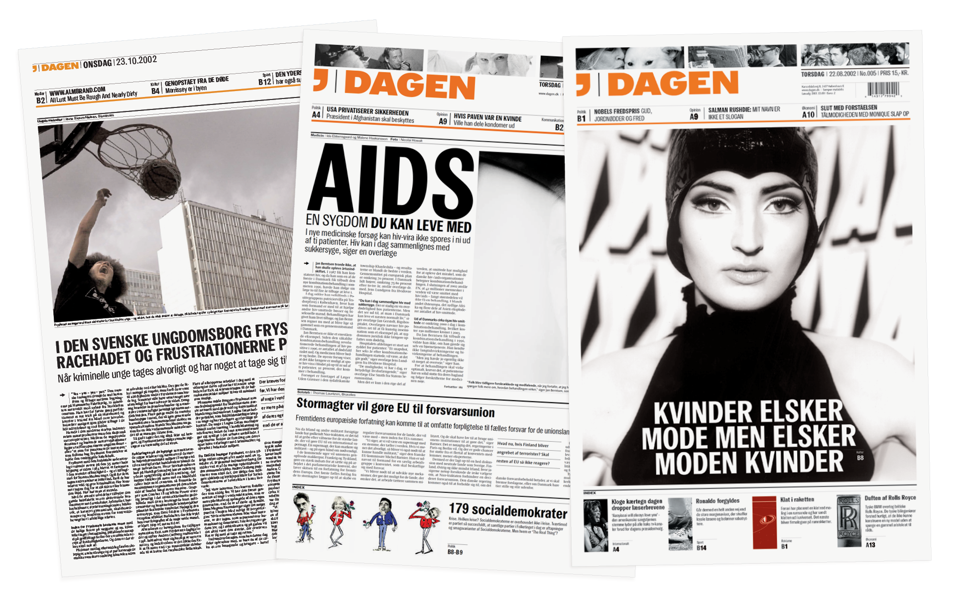
DAGEN ceased to exist after a mere 41 days before declaring bankruptcy at the end of 2002. The newspaper was discussed heavily the following years — but why this interest? Maybe because DAGEN represented something as rare as a generous vision — a higher purpose: aesthetically, politically and journalistically. But it could also be that the legacy of DAGEN was written by its provoked competitors.
The newspaper managed to amass 13.000 subscribers and 20.000 buyers in its first 4 weeks of existence — which was excellent numbers for a new Danish newspaper. A big part of DAGEN was its visuals which e-Types had been working the most of 2002 on developing. Jonas Hecksher designed a new typeface especially for DAGEN called: Publish Gothic.
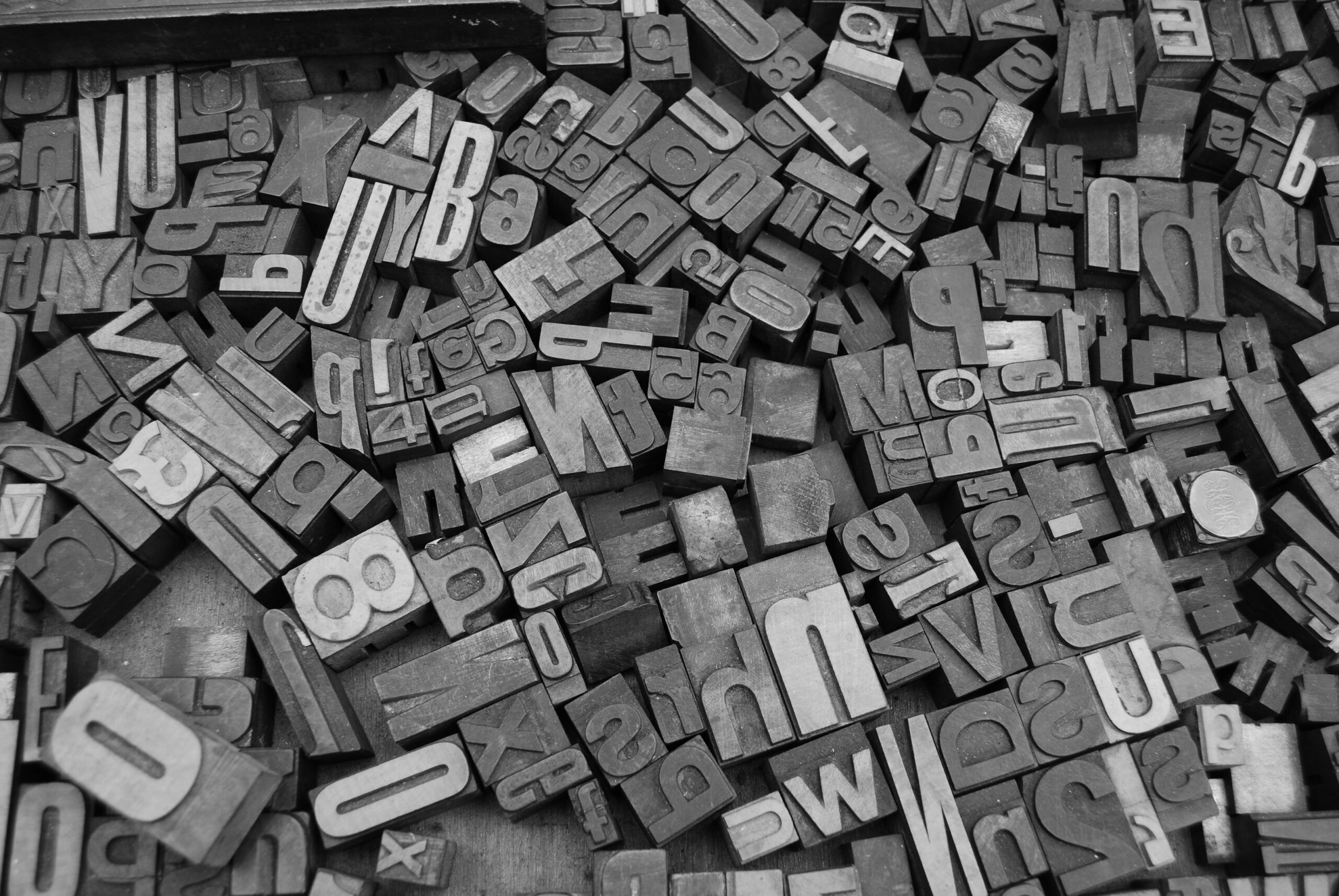
“We were inspired by old newspapers, which were set with woodtypes. The woodtypes was cut a bit crooked, which showed in the newspaper typefaces. We took that same aesthetic and applied to the DAGEN newspaper. The typeface couldn’t be perfectly drawn since the idea was that uniformity and traditions didn’t belong in DAGEN” tells Jonas Hecksher reminiscing the process.
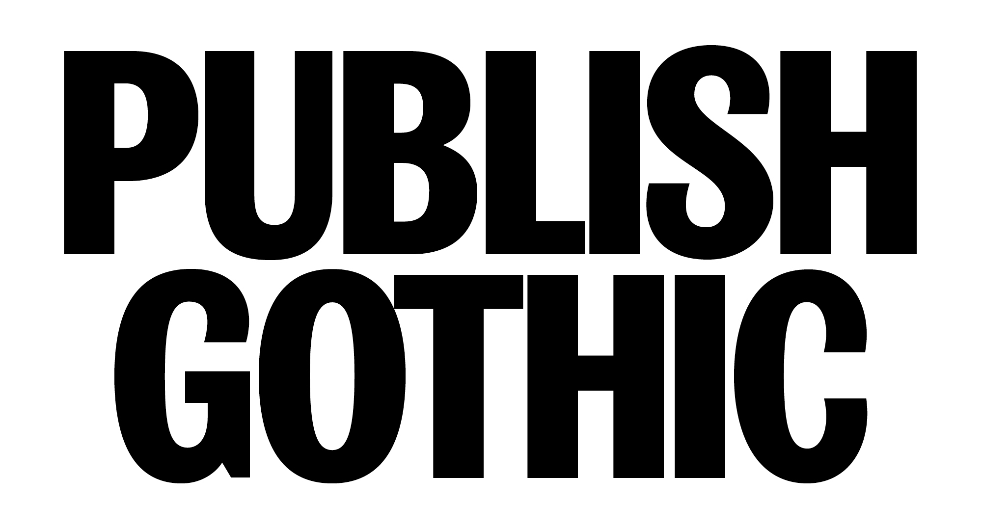
When designing Publish Gothic for DAGEN it was a balance between renewal and tradition — between the new and the old. The design was successful and e-Types was awarded with several design awards for their work in the categories of: typography, publications and visual identity. Despite the newspapers short lifespan, Jonas Hecksher kept Publish Gothic in the back of his mind, always feeling its timeless character could lead to its resuscitation.
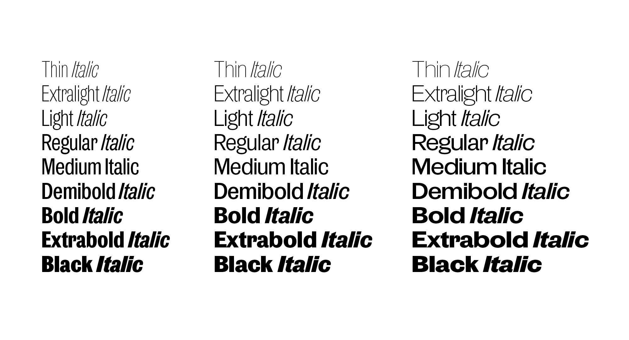
And here it is, seeing the light of day almost two decades later as the newest addition to PLAYTYPE‘s type catalogue. Updated and refined for the modern-day, the Publish Gothic family includes a total of 54 individual styles, divided into three distinctive widths: Condensed, Normal and Expanded. As a result, the typeface is extremely versatile; making it just as suitable for characterful headline messaging as it is for functional body copy. In addition to its huge range of weights and widths, a number of stylistic sets allow the typeface to be personalised further to fit the required application.
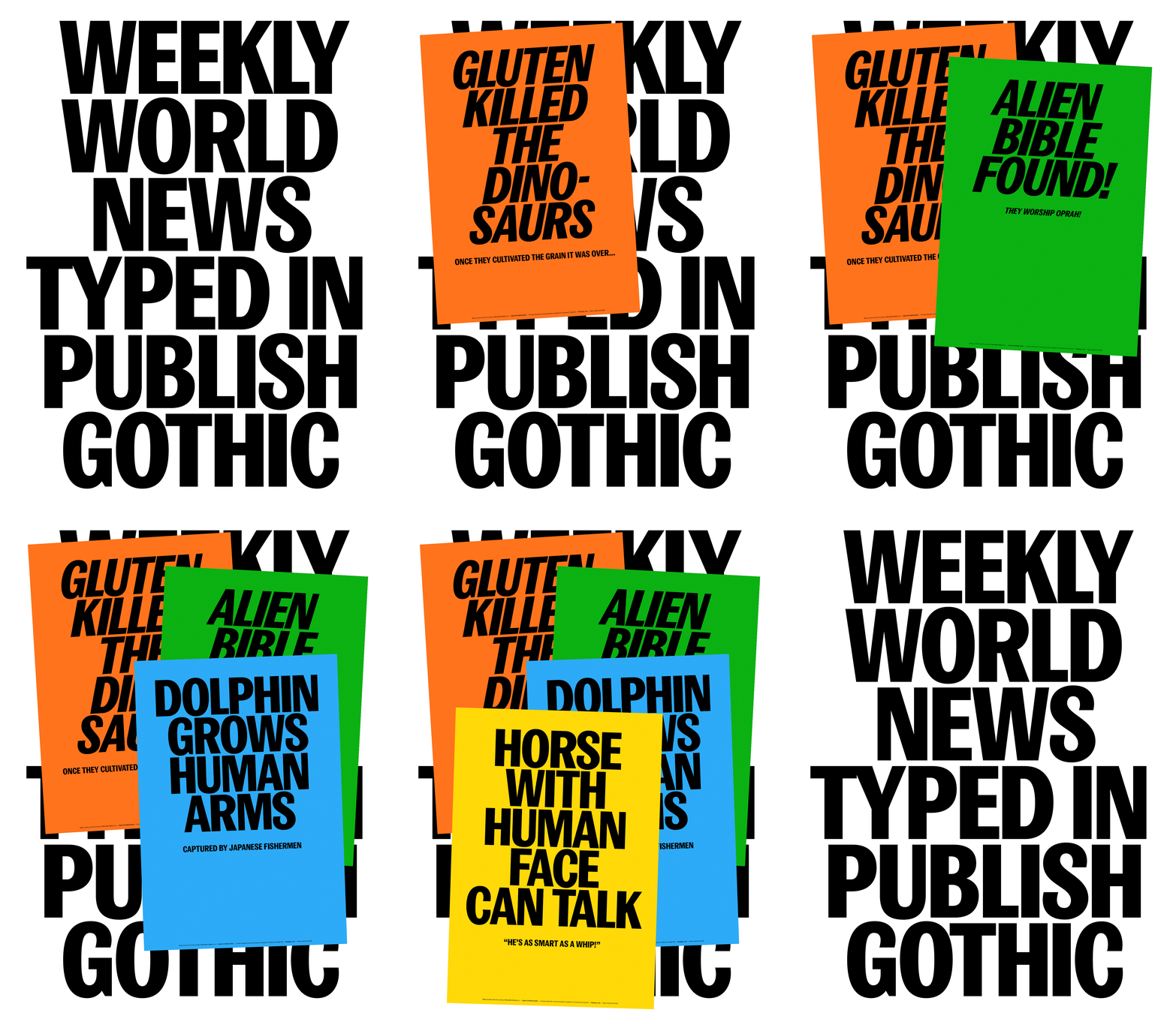
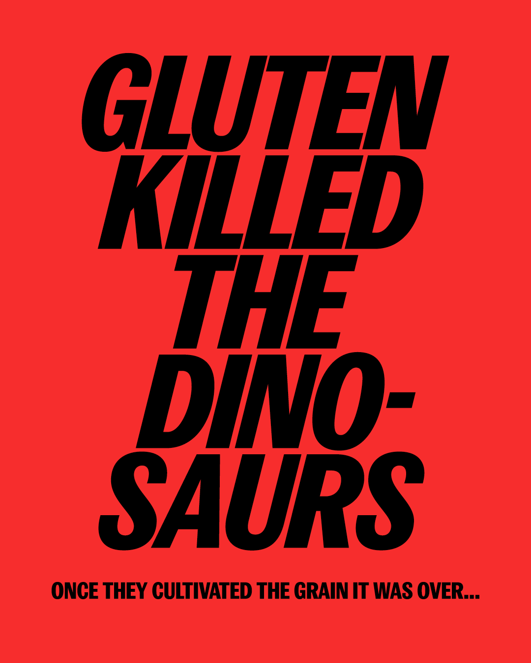
For the launch of Publish Gothic, PLAYTYPE partnered up with the Weekly World News, a historic publication known for posting outlandish fictional stories between 1979 and 2007. The result of the collaboration sees Publish Gothic presented in a selection of PLAYTYPE’s favourite headlines from the iconic publication; connecting the typeface back to its short-lived newspaper origins.
