December 8th, 2022 / ARTICLE

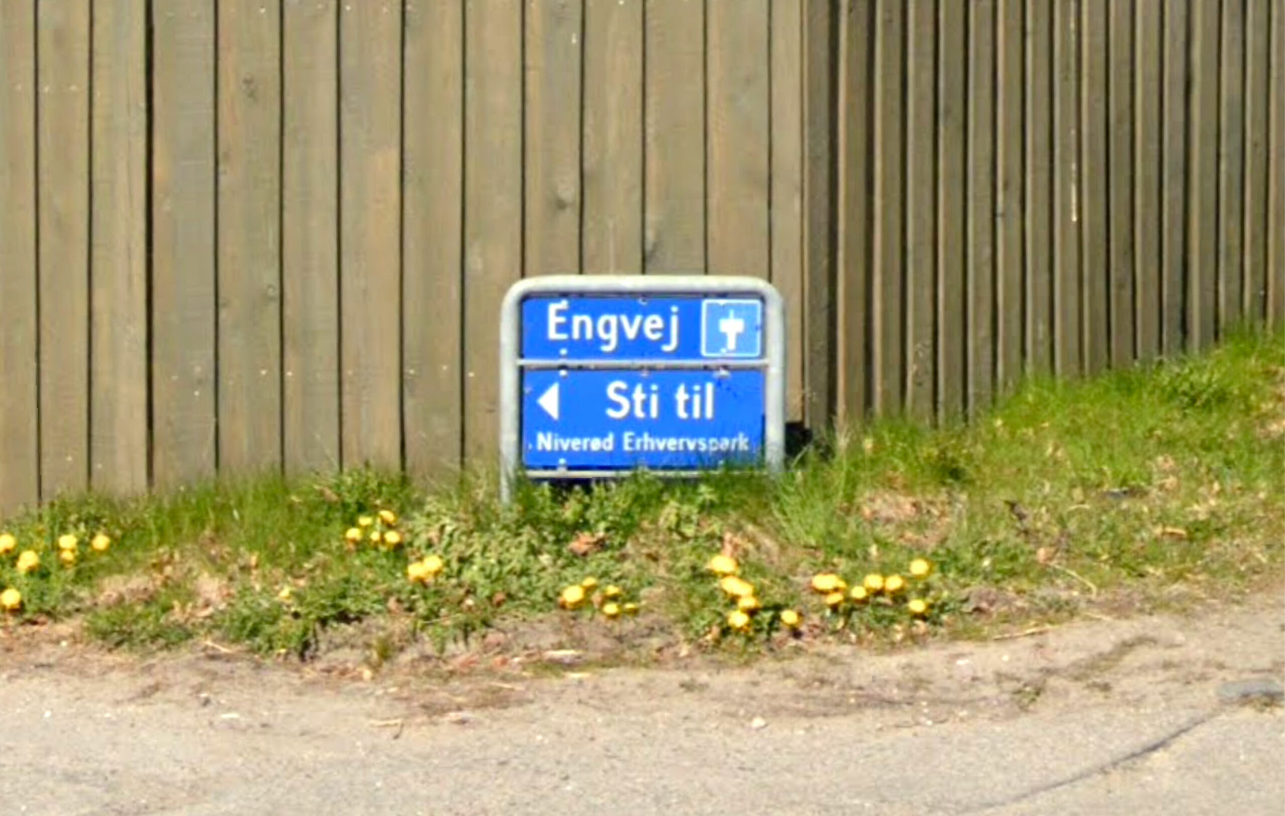
If you’ve ever spent any time in Denmark, you’ll have seen it. It would have told you where you are, what to do, and what not to do. It adorns some kind of signage in almost every street in the land, and for a font that signposts so many of the mundane details of everyday life, it’s remarkable how much of a mystery it remains.
In the early 2000s, Playtype founder Jonas Hecksher was busy creating Fru Olsen, a serif typeface inspired by classic Danish signage. While researching and scavenger hunting for examples of the street signs that inspired Fru Olsen, he stumbled upon another somewhat unassuming yet equally intriguing typeface. He tried to discover the source, but the more he dug, the colder the trail went. He called signage companies and local council offices but nobody knew who’d created the font, or the story behind it.
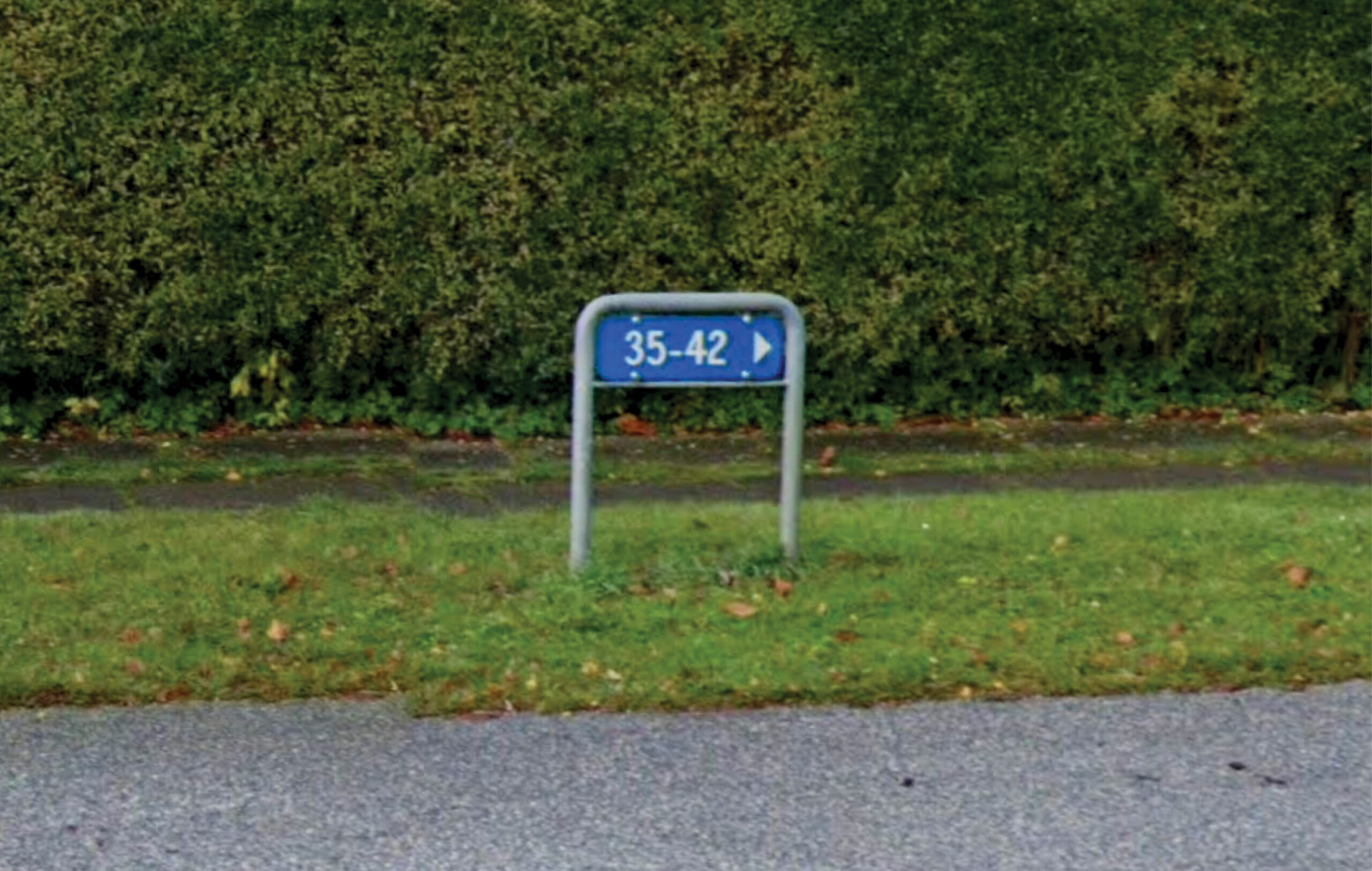
We found ourselves in sort of a – not seeing the forrest for the trees scenario. We couldn’t really believe we hadn’t paid attention to this utilitarian and widely used piece of design before, which only added to our eagerness to know more. Eventually, on a hunch, we contacted Dansk Standard and got lucky. The font was created for them in 1954 and its name was Dansk Standard 737*.
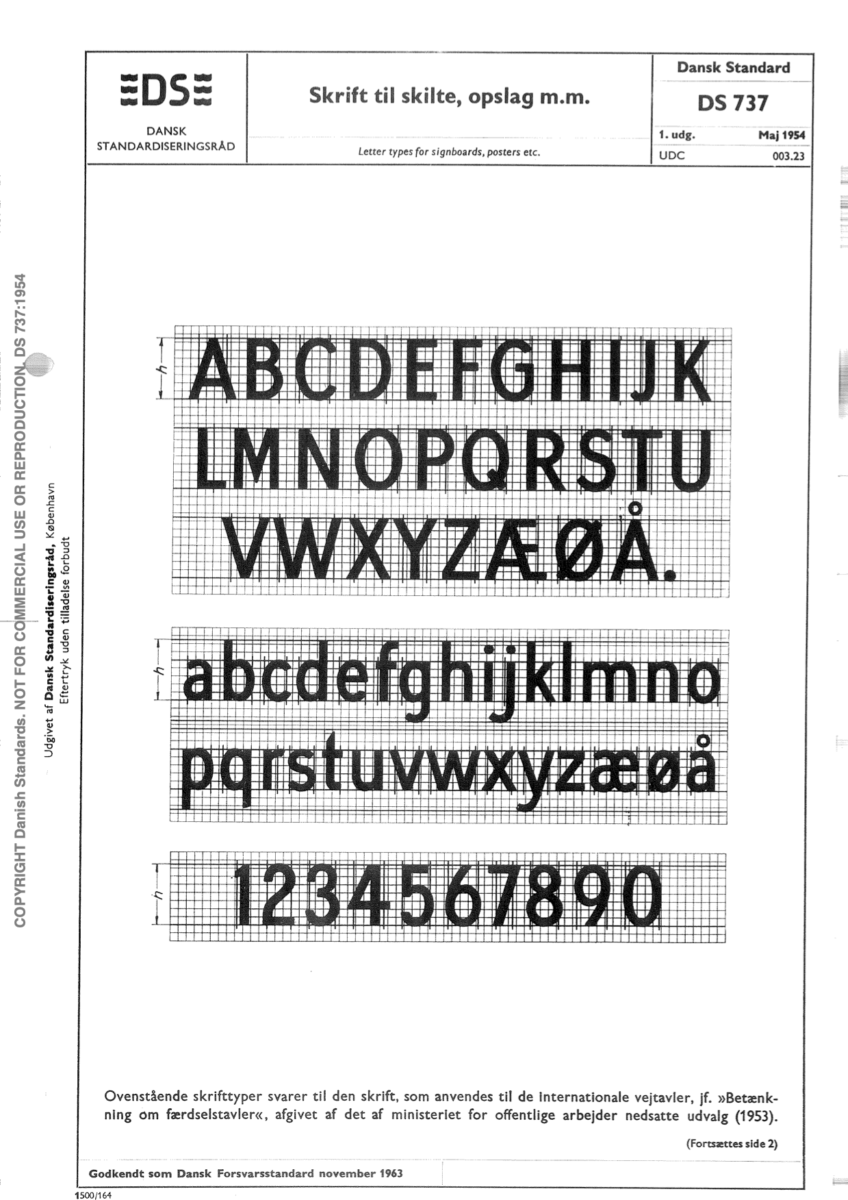
According to Steen Ejlers, Associate Professor Emerita at Det Kongelige Akademi (Royal Academy), the type was probably created by an engineer at Dansk Standard rather than a type designer. Denmark didn’t have a typography education in the mid-20th century. Instead, fonts – and public lettering work in general – were developed by sign-painters, graphic designers, engineers or, most often, architects.
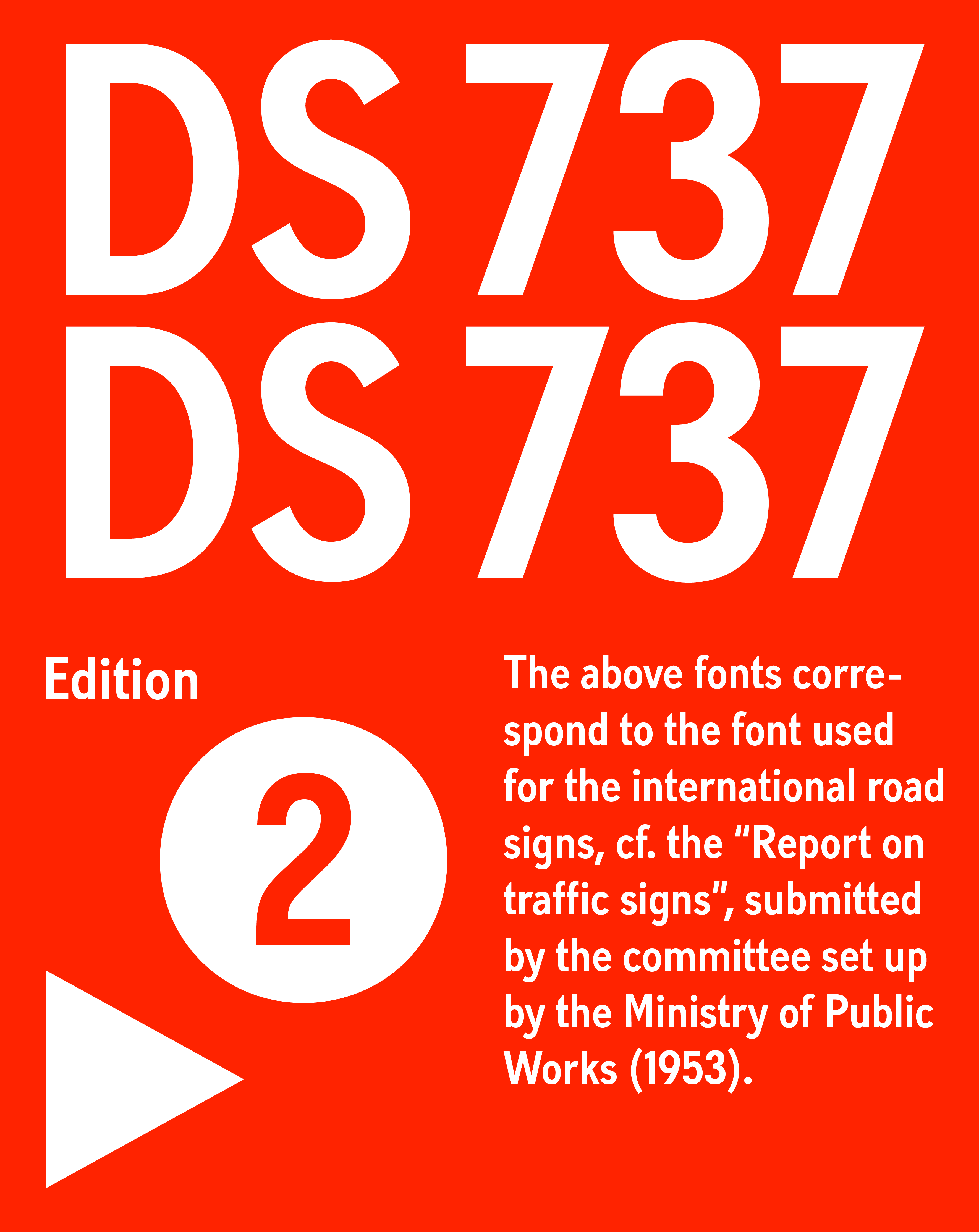
The font itself is a utilitarian and functional sans serif but it’s certainly not bland, plain or overly neutral. Initially designed for signage, it had one objective: to communicate clearly. This shows in the stroke contrast, and the vertical, somewhat open counters of the typeface. The distinctive detailing and proportions make it a very recognisable font, even in all uppercase.
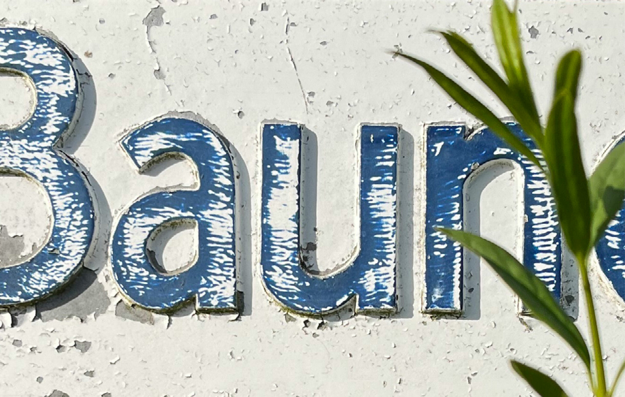
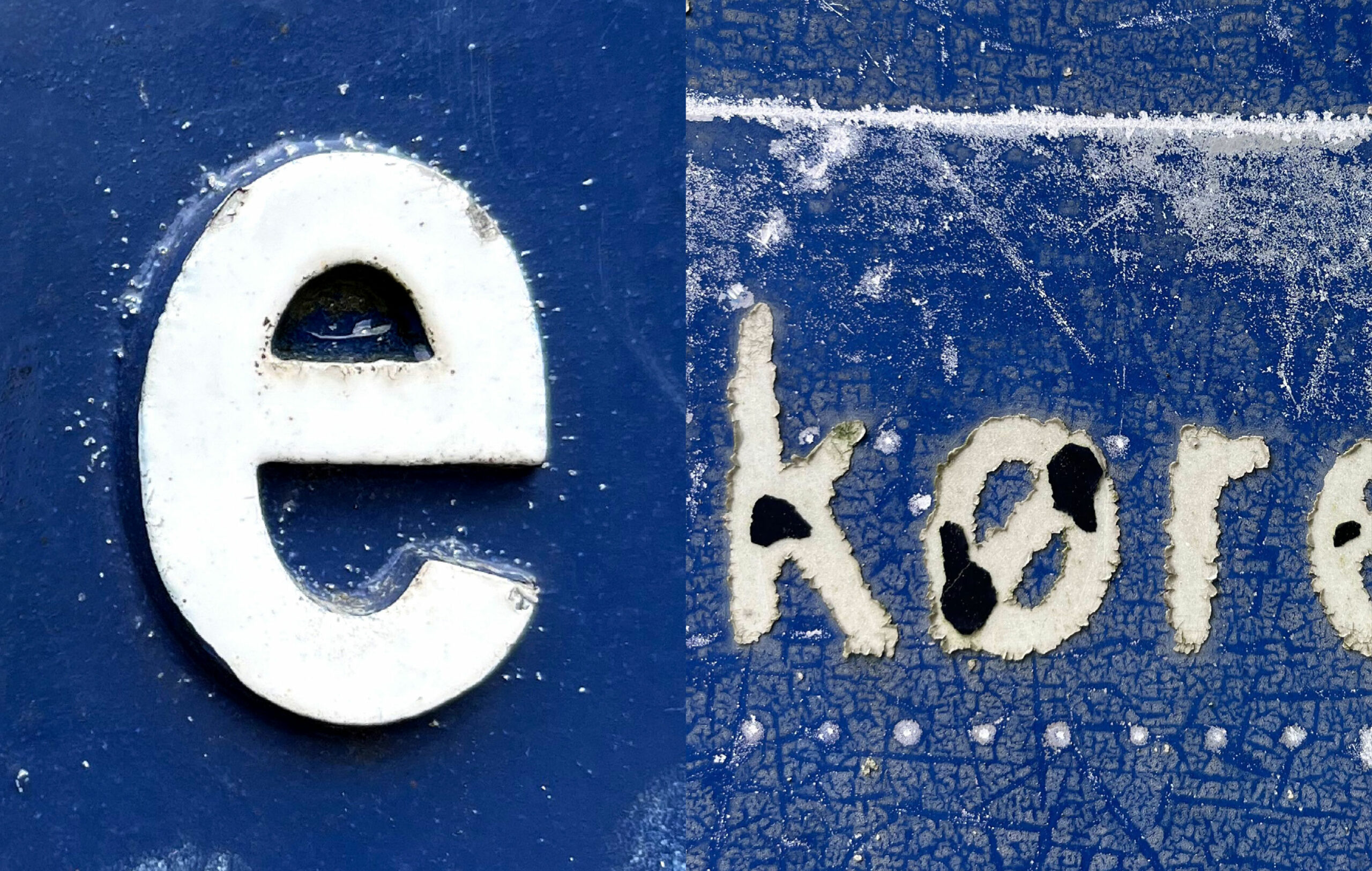
The more we got to know DS737 and the more time we spent with it, the more we began to appreciate its personality and detailing. This appreciation lead to an urge to shine a light on the mystery of DS737 – the typeface that is so familiar and yet so unknown to us all.
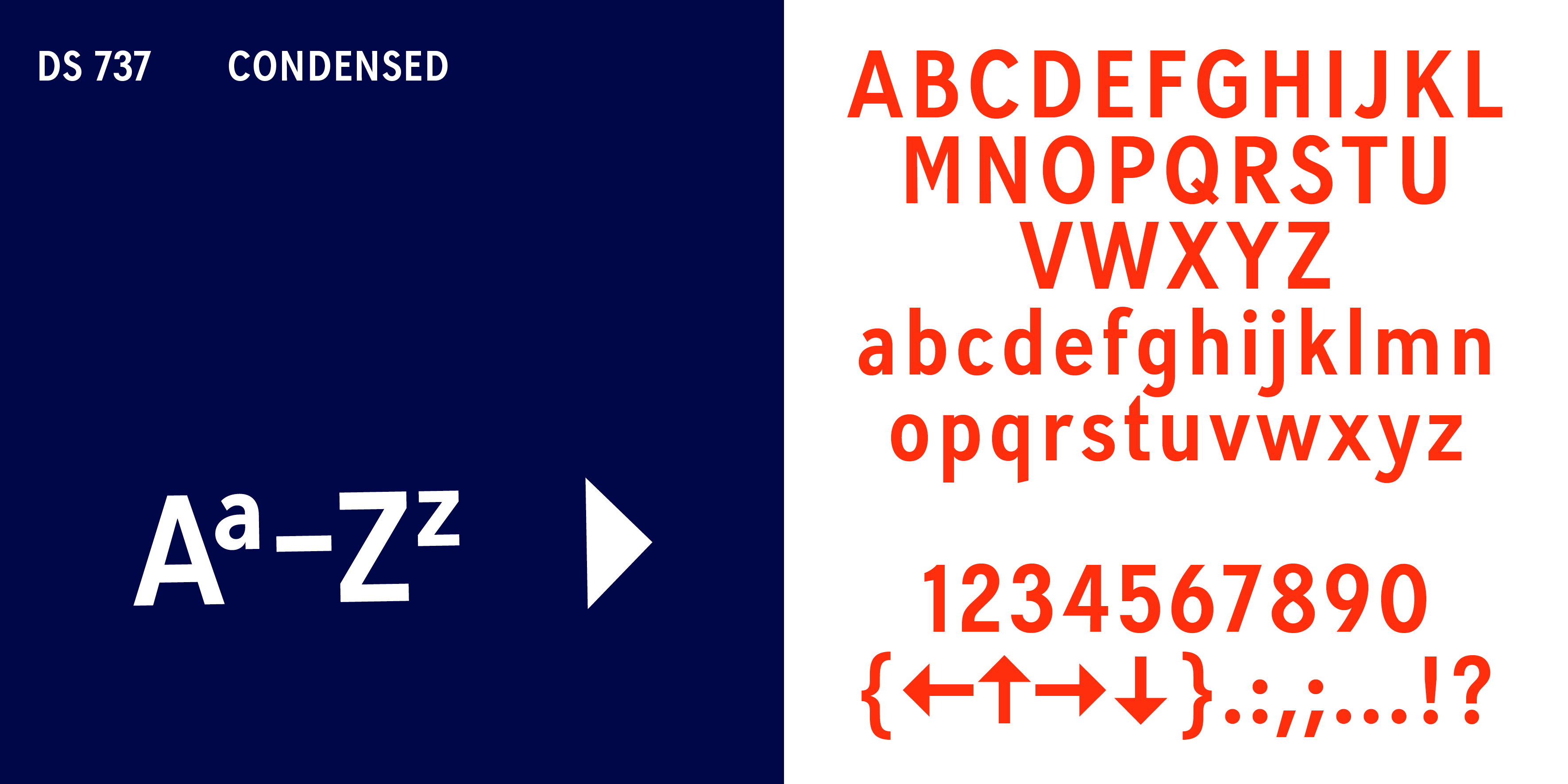
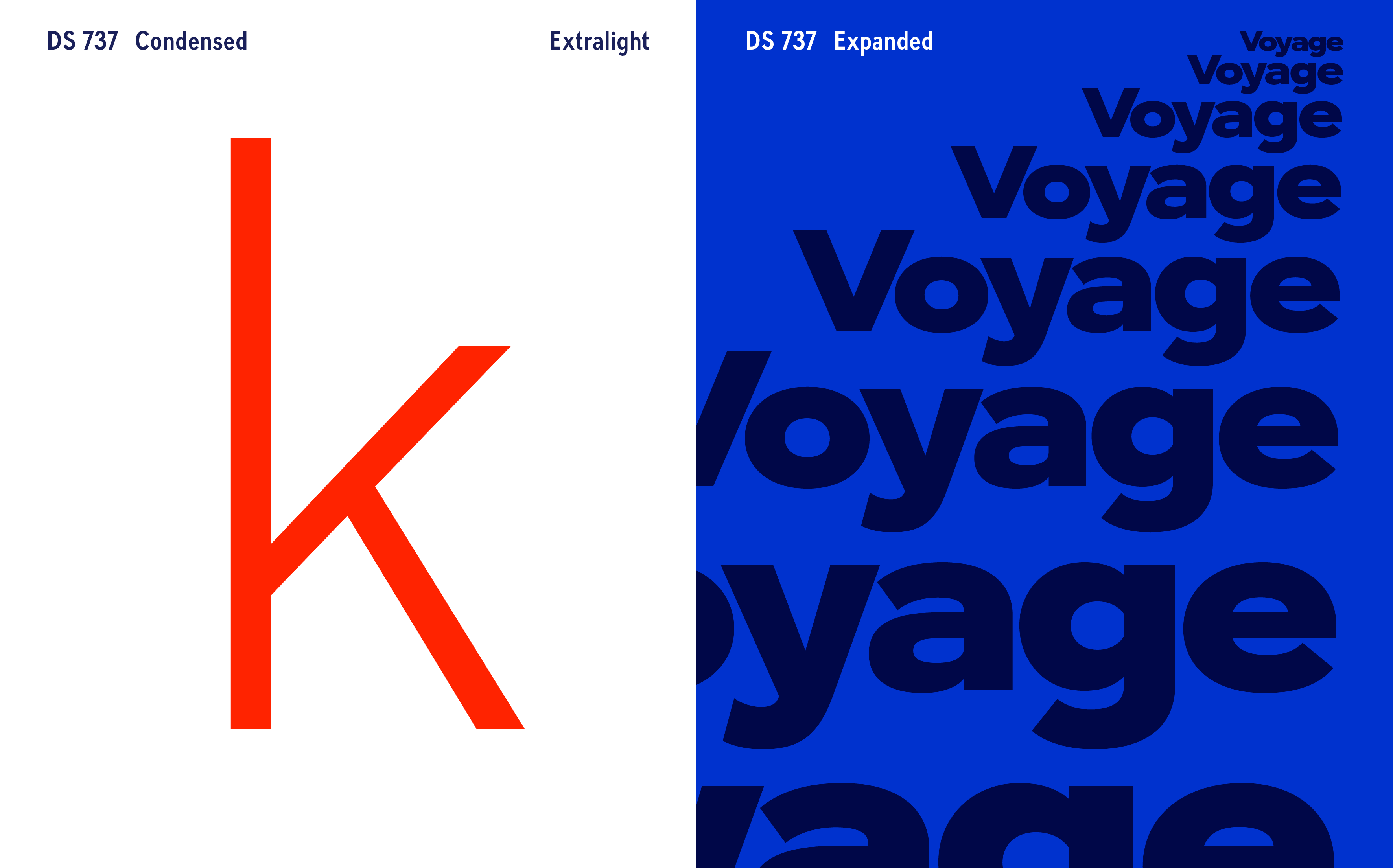
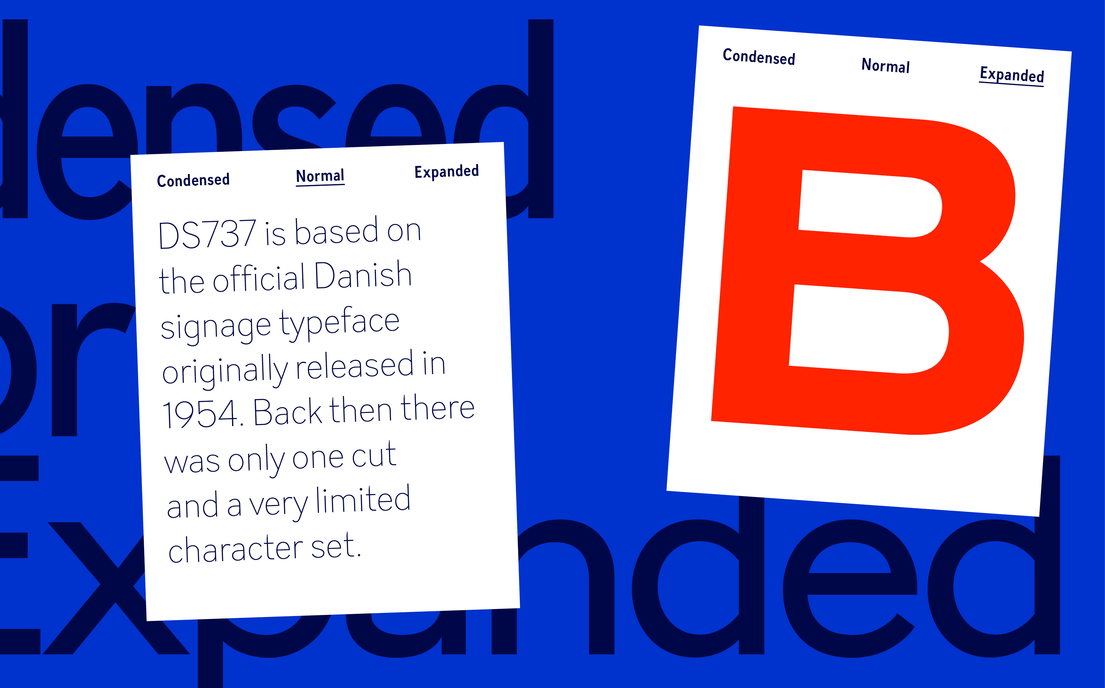
Back when the DS737 was first released in 1954, it only existed in one cut and a very limited character set. Now being released 69 years after, we set about reinventing and expanding it into a larger system of typefaces with different weights, widths, italics and extensive language support. When doing this, one of the most important things for us was to stay true to the original.
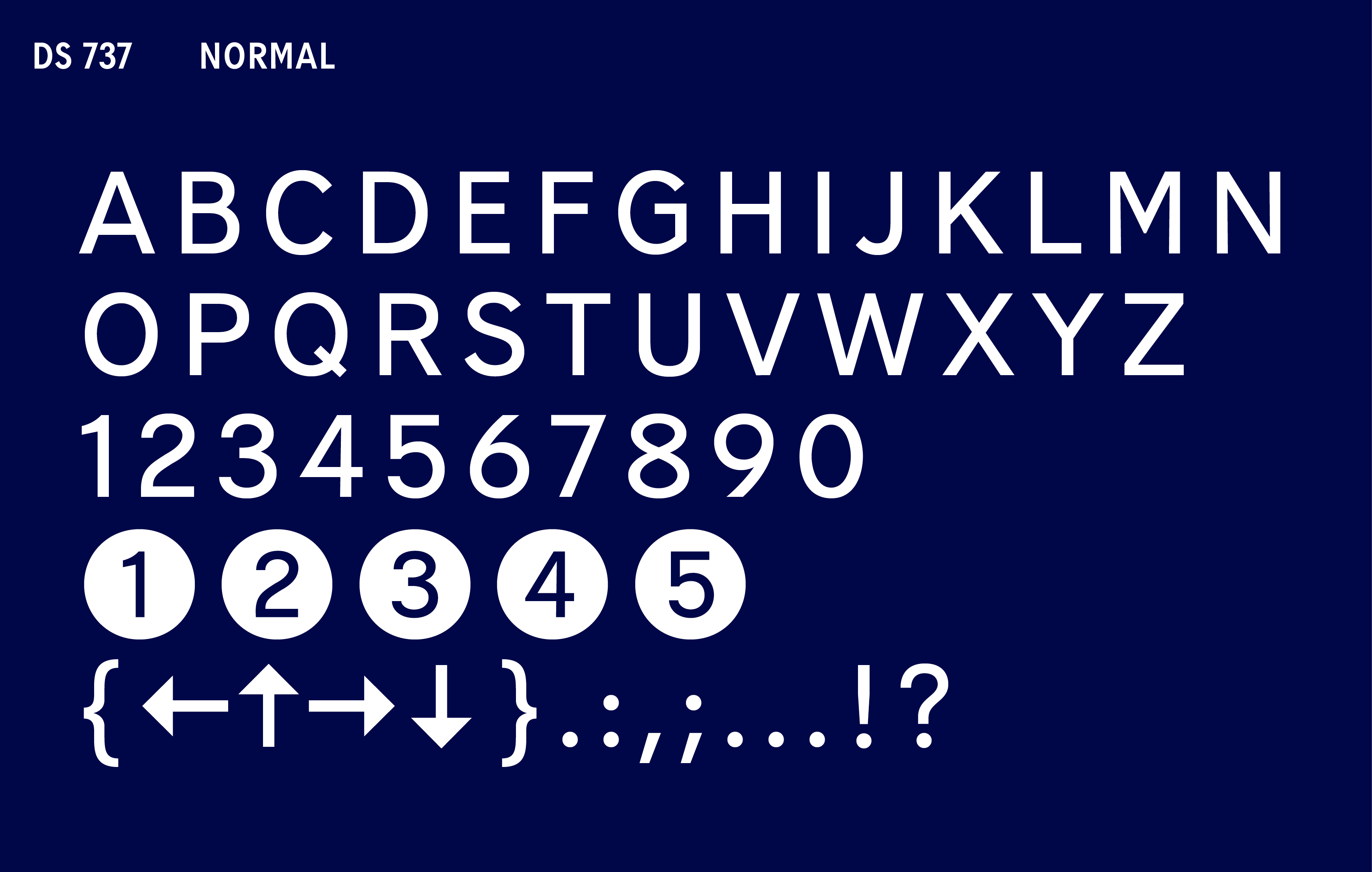
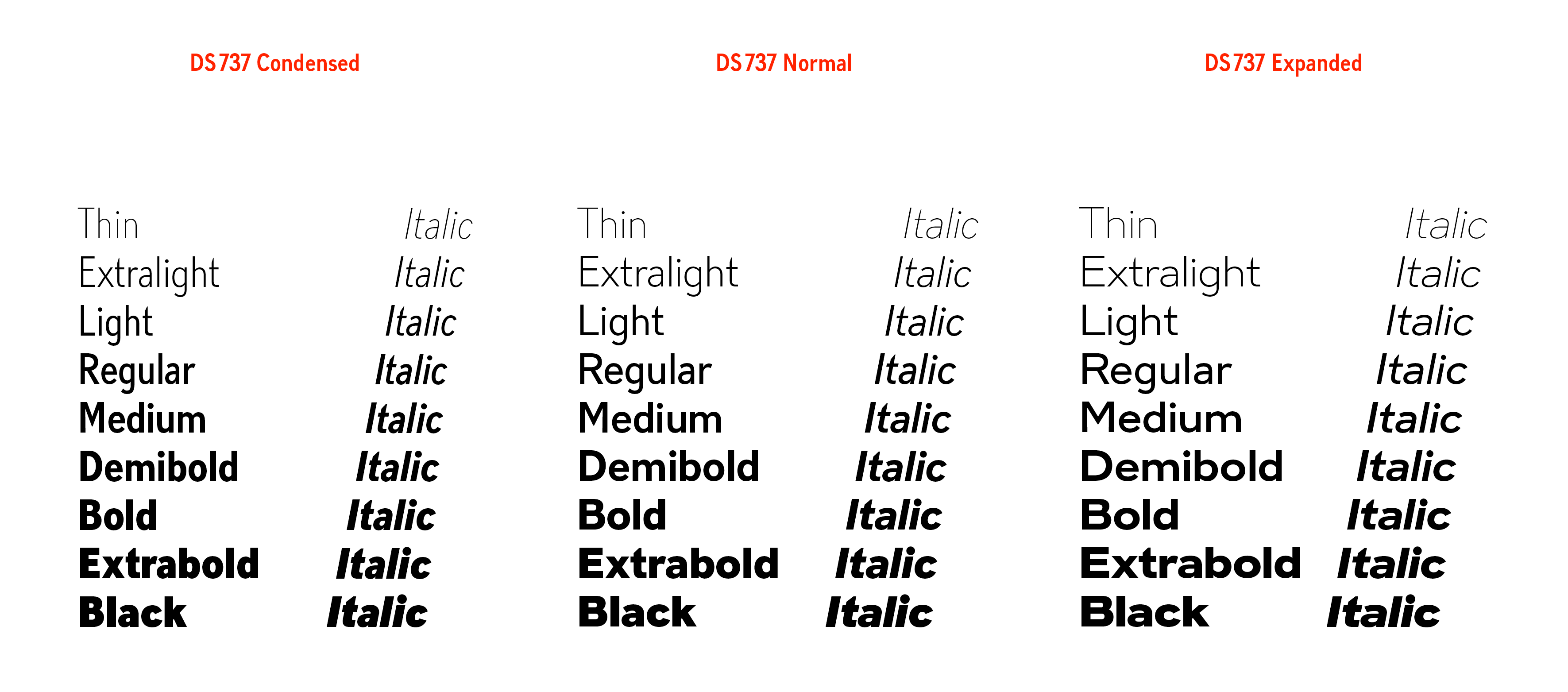
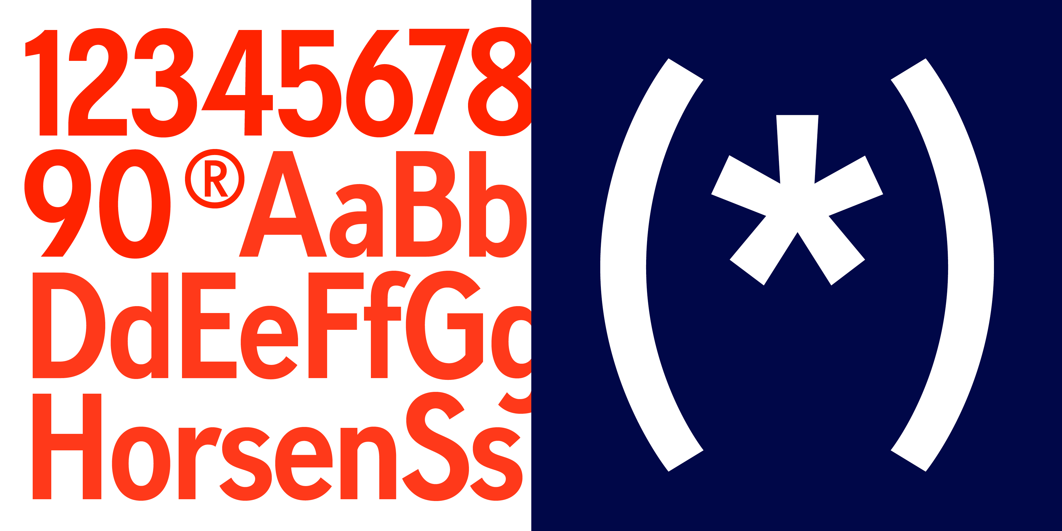
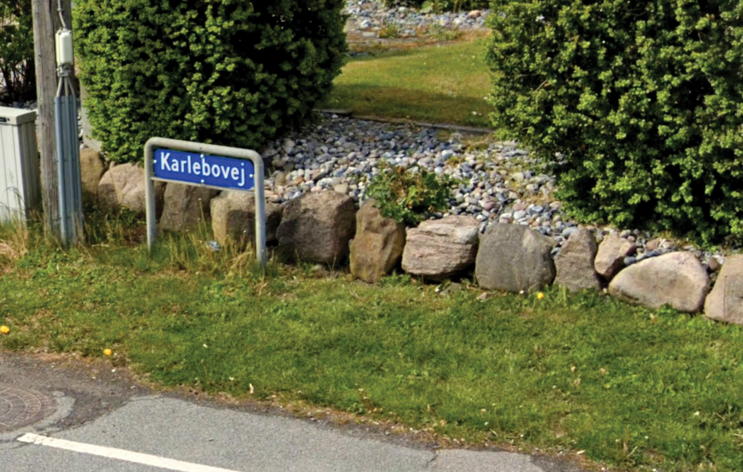
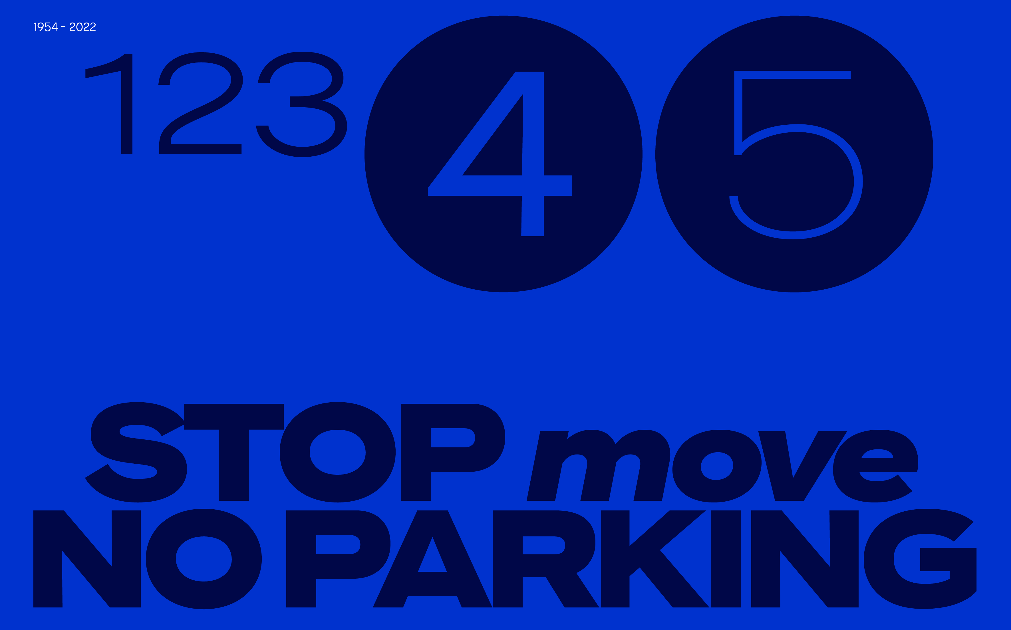
DS737 lends itself to a wide range of uses. It’s a workhorse typeface in smaller sizes, but when used large scale, the detailing and personality shine through. Jonas concludes: “It’s been a labour of love resurrecting this font and the mystery behind its origins have made us even more determined to do it justice. Whoever originally made it ended up creating something timeless and we’re super excited to finally be able to release our take on this piece of Danish design history. We can’t wait to see it be put to use and become part of the long lived DS737 heritage.”
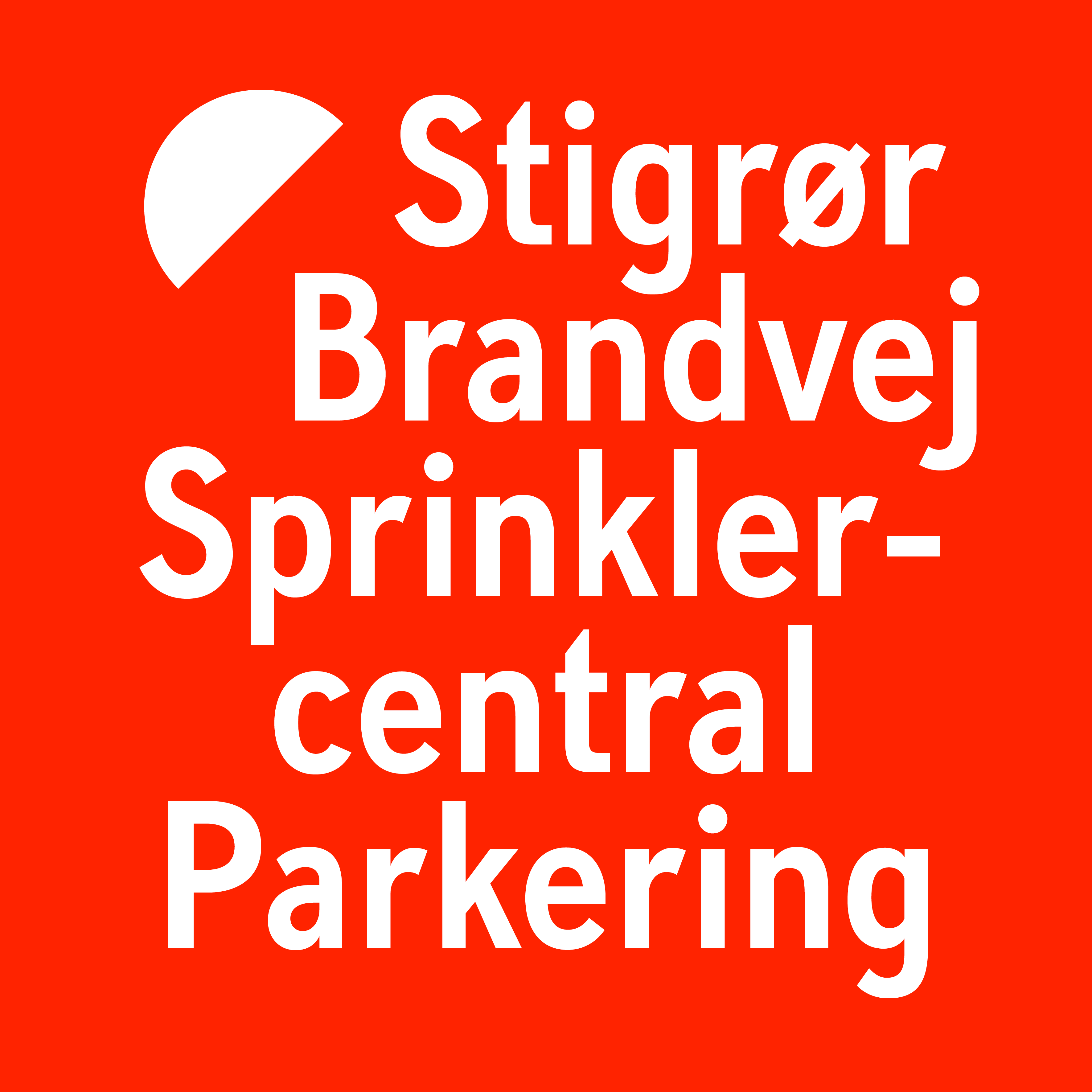
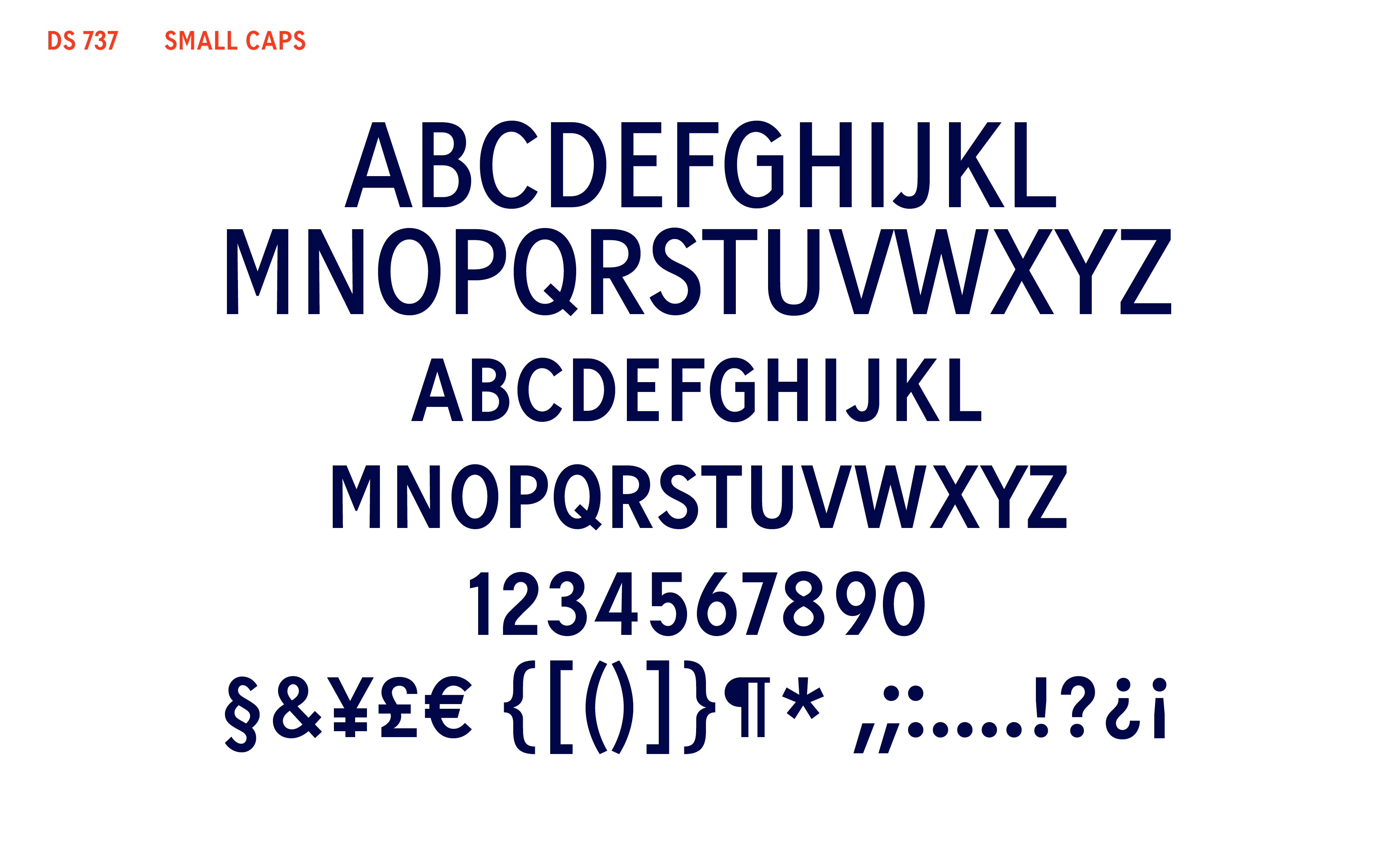
The family features all the open type features of contemporary typefaces including small caps, ligatures, contextual alternates and a range of stylistic sets that give the user alternatives for certain glyphs, making the typeface even more versatile. The original glyph set was tiny but Dansk Standard now supports approximately 220 languages, including Volapük.
