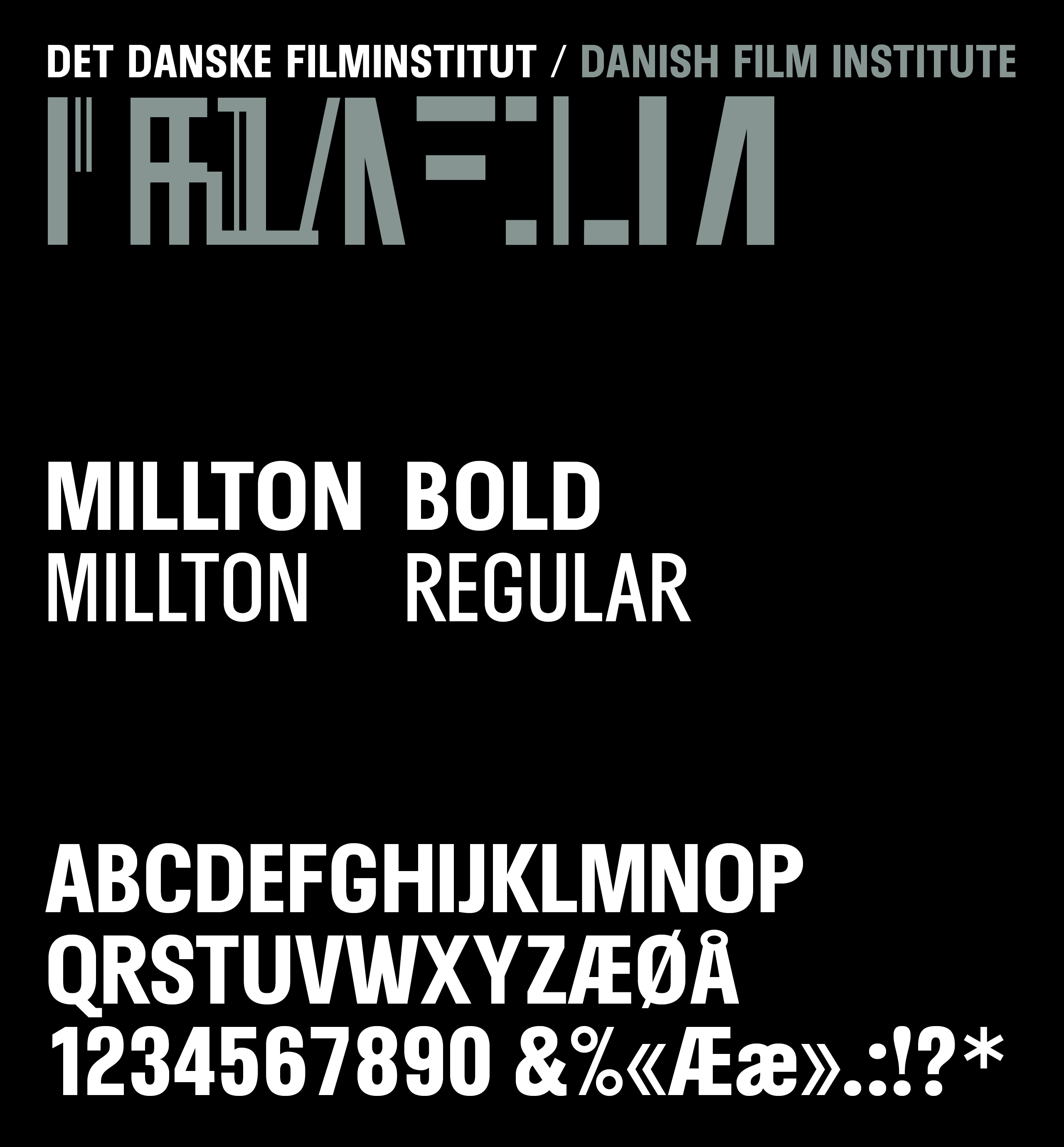
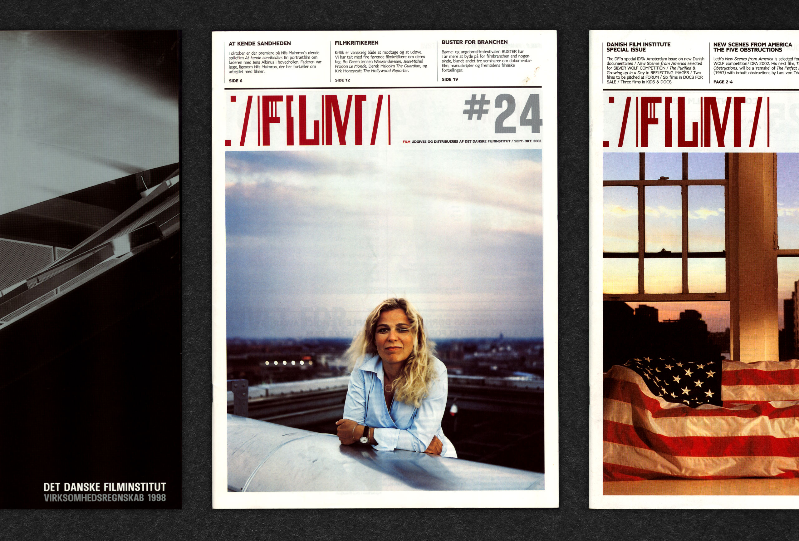
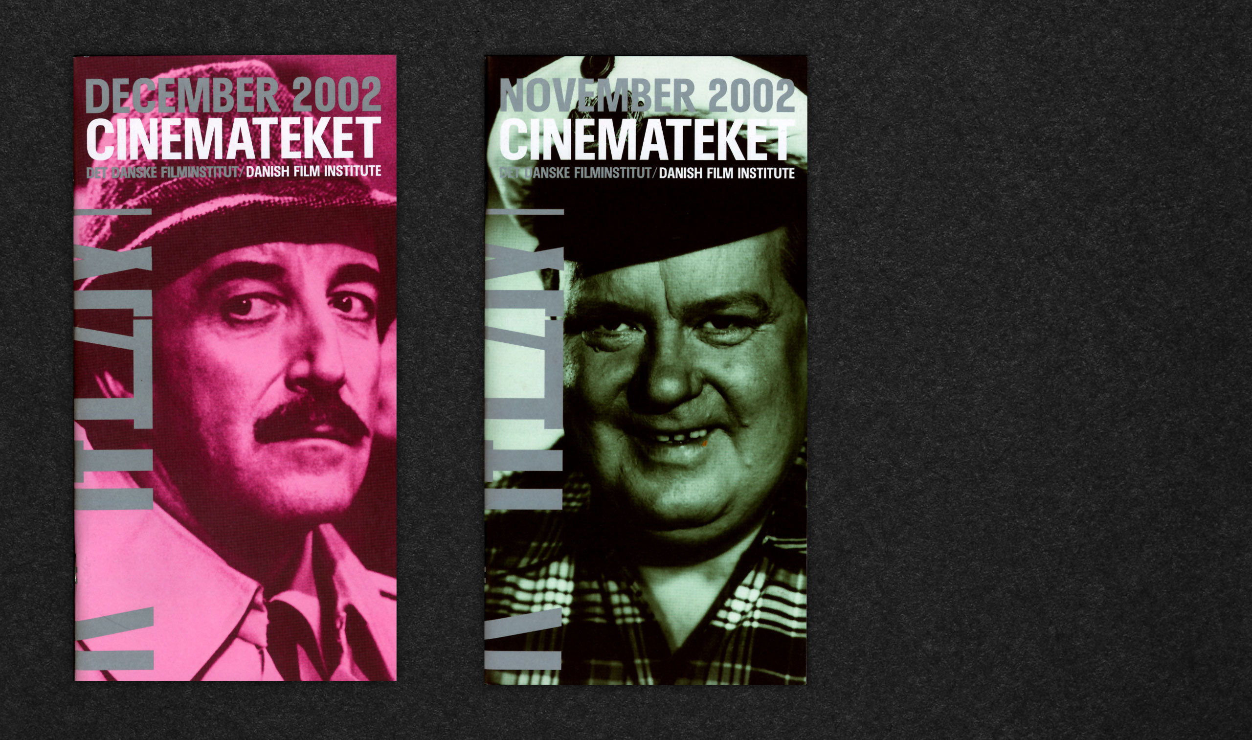
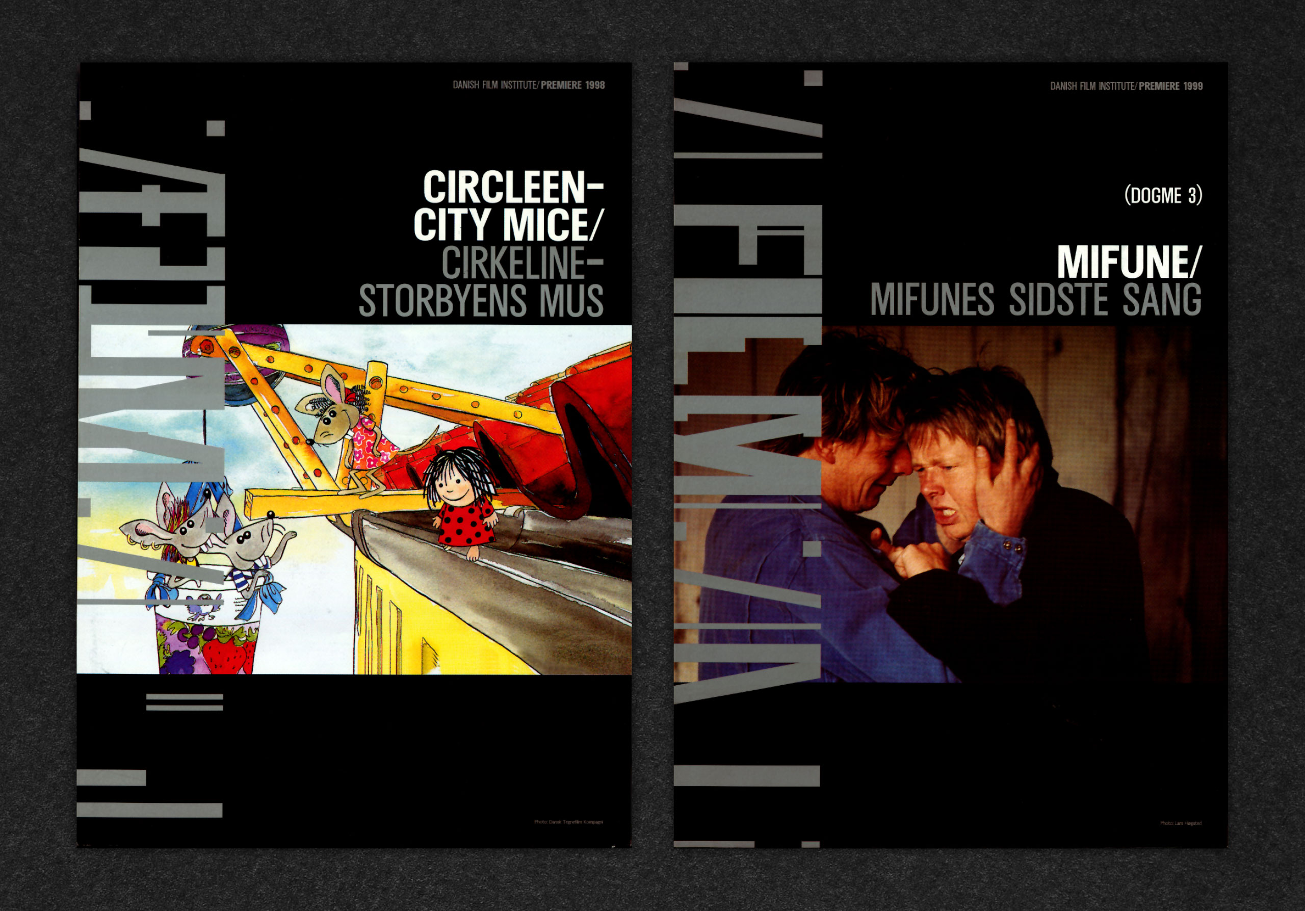
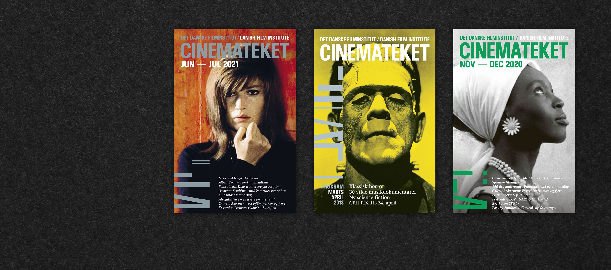
Font name: Millton
Client: Danish Film Institute
Agency: e-Types
Year: 1998
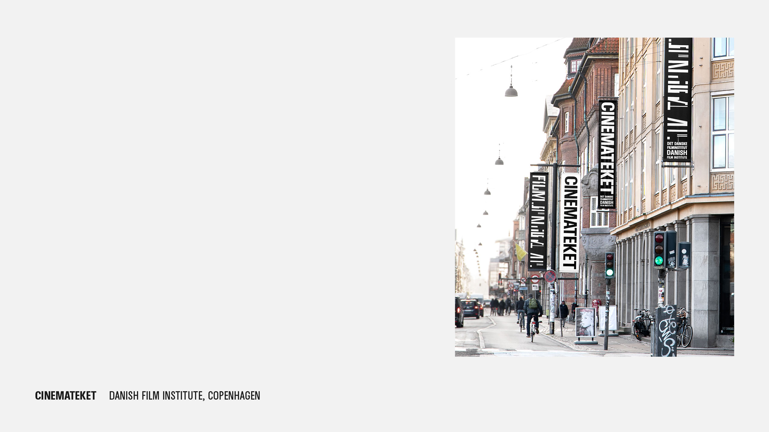
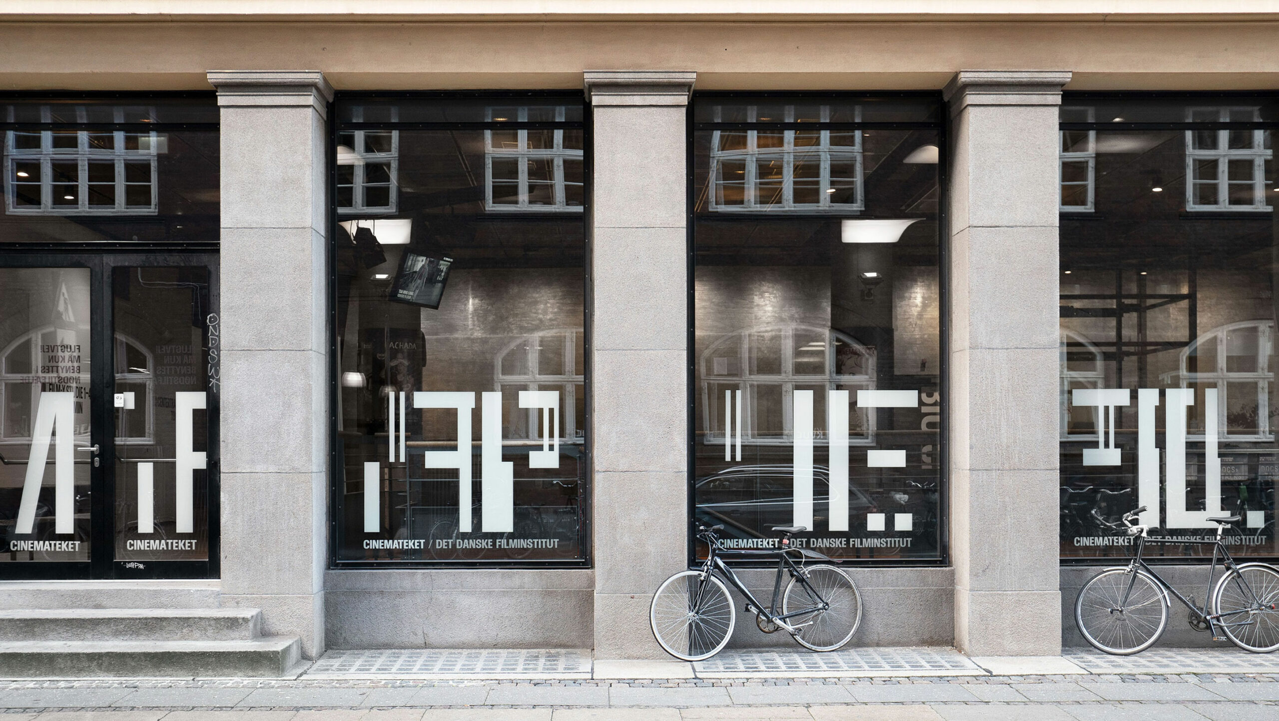
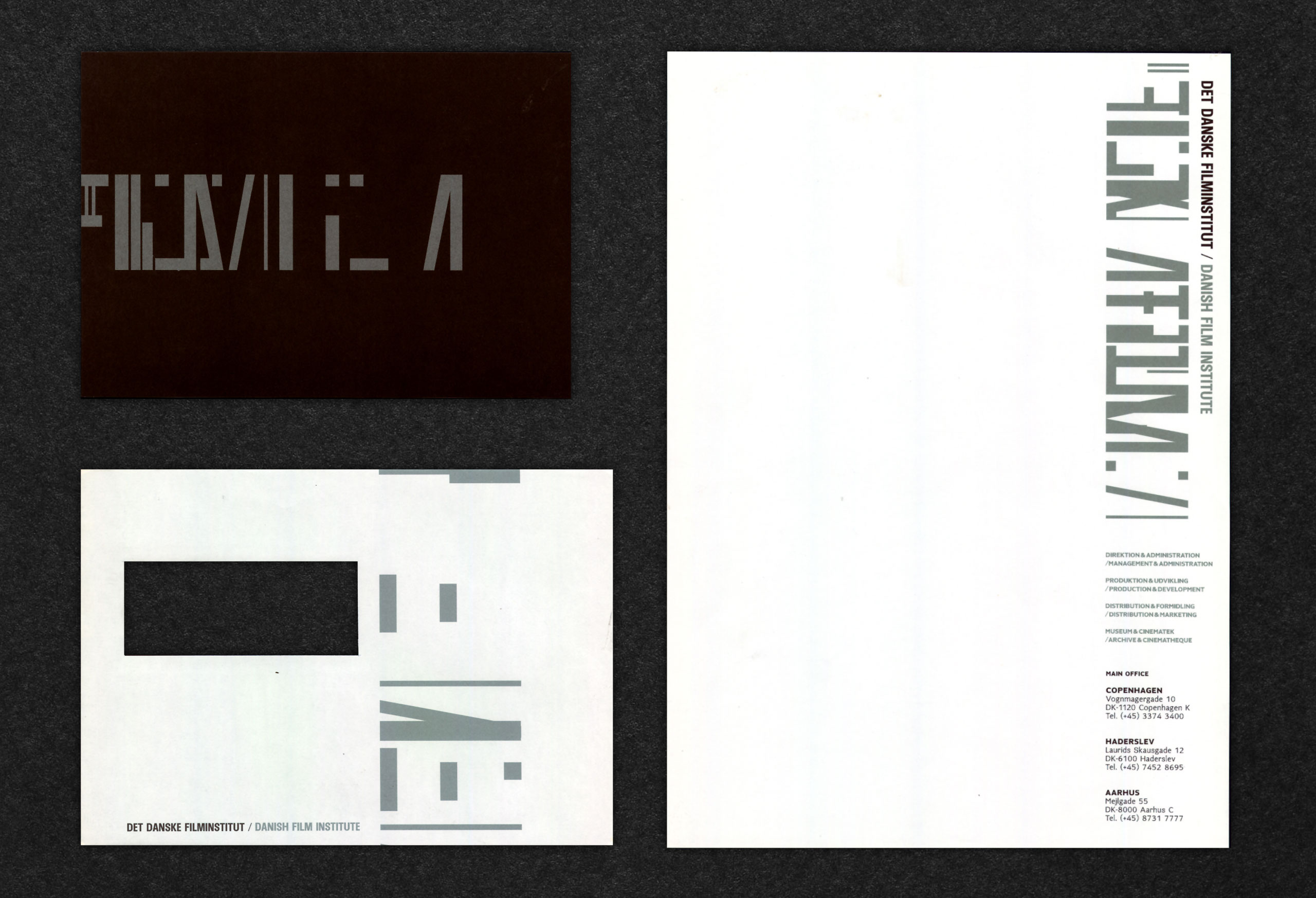
As part of the visual identity for Cinemateket – Danish Film Institute – designed by e-Types in 1998, we did a bespoke typeface, inspired by original movie posters and early cinema aesthetics. To this day the typeface has remained a central element of DFI’s visual identity. The identity and the typeface is – just like DFI itself – a celebration to the history of film making from beginning to end. Under the creative title ‘It Only Works on Film’, e-Types developed a logo which in itself is based on the mechanism of the classic chronophotography, and mimics the way that an early day motion picture would act. When used statically, the logo appears in a myriad of fascinating freeze frames, creating a fragmentarized and puzzling look – but when put into motion, the different pieces of the logo spin into place to form a solid version of the logo lockup – just like it would on film. The fragmented version of the logo furthermore becomes activated throughout the identity as a 5th element, where it is sized up in scale as a super graphic. The references to history is also kept alive through the use of a simple, three swatch colour palette consisting of black, white and silver; the three primary colours existing within film making up until the first popular colour processes were initiated in the 1940’s and 50’s.