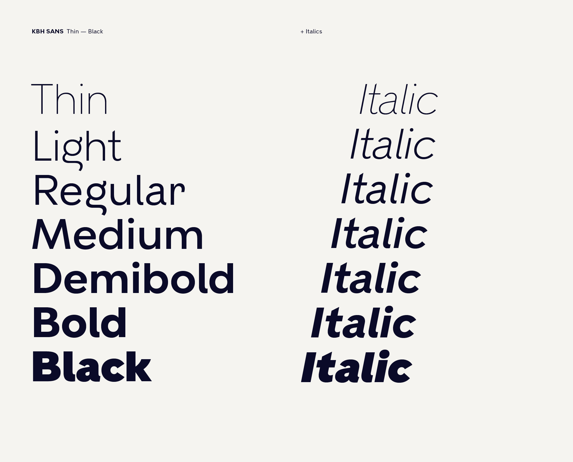
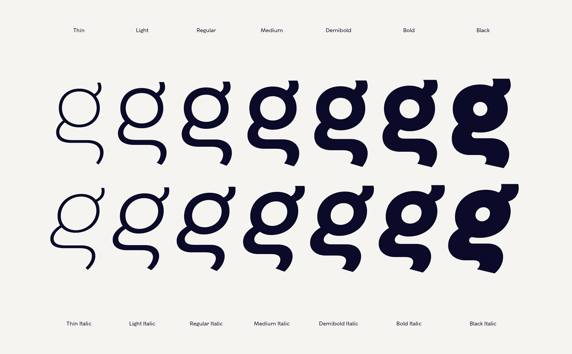
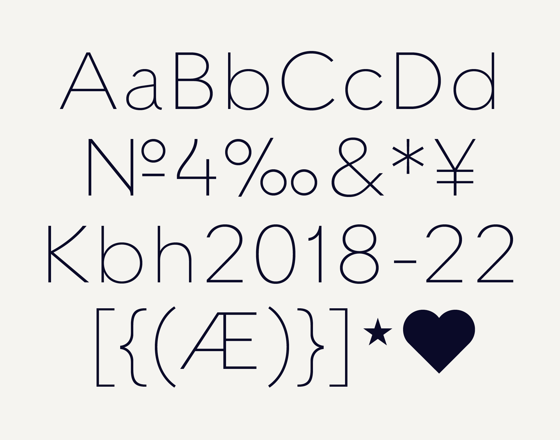
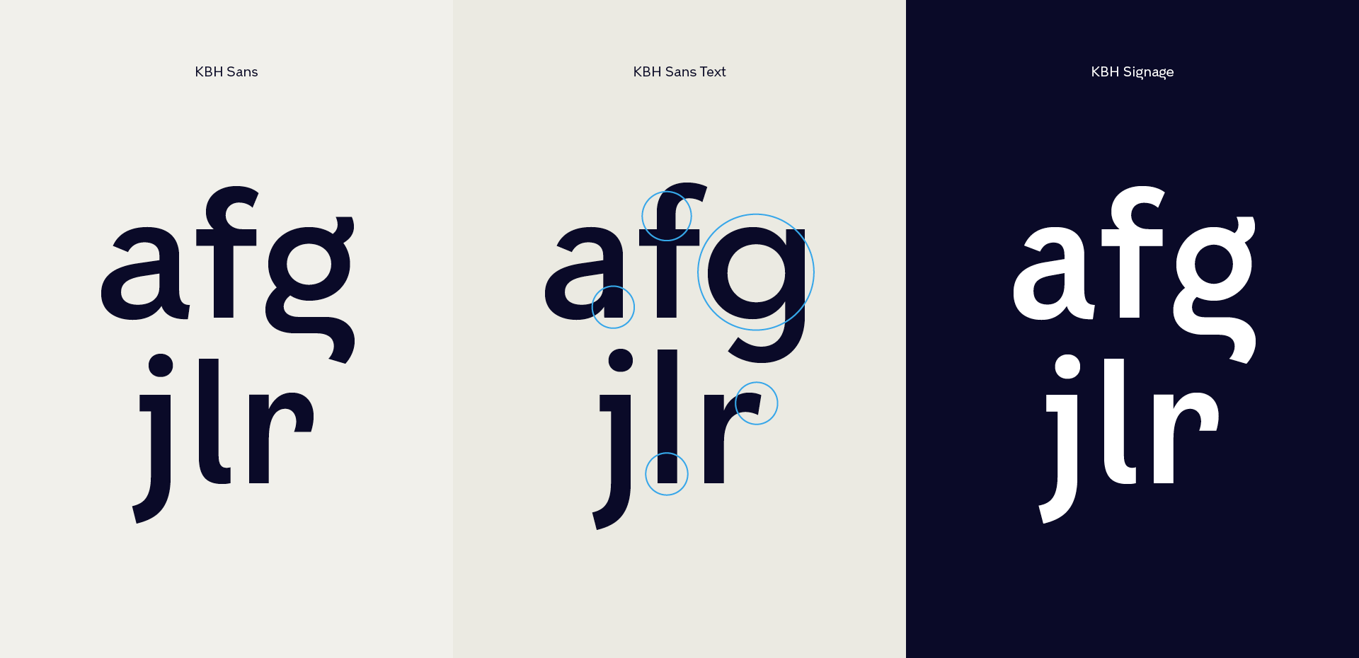
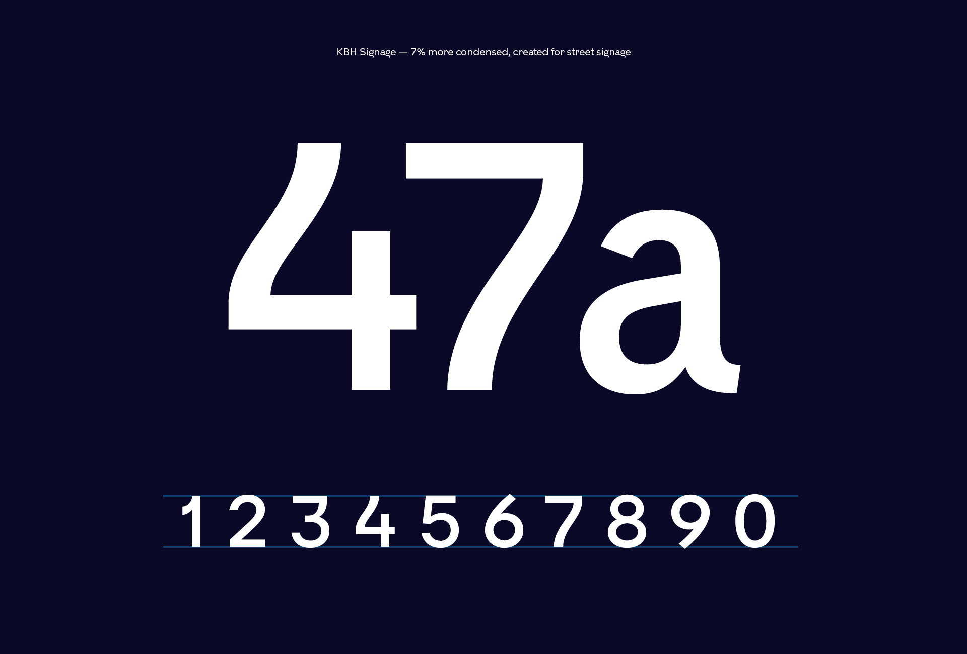
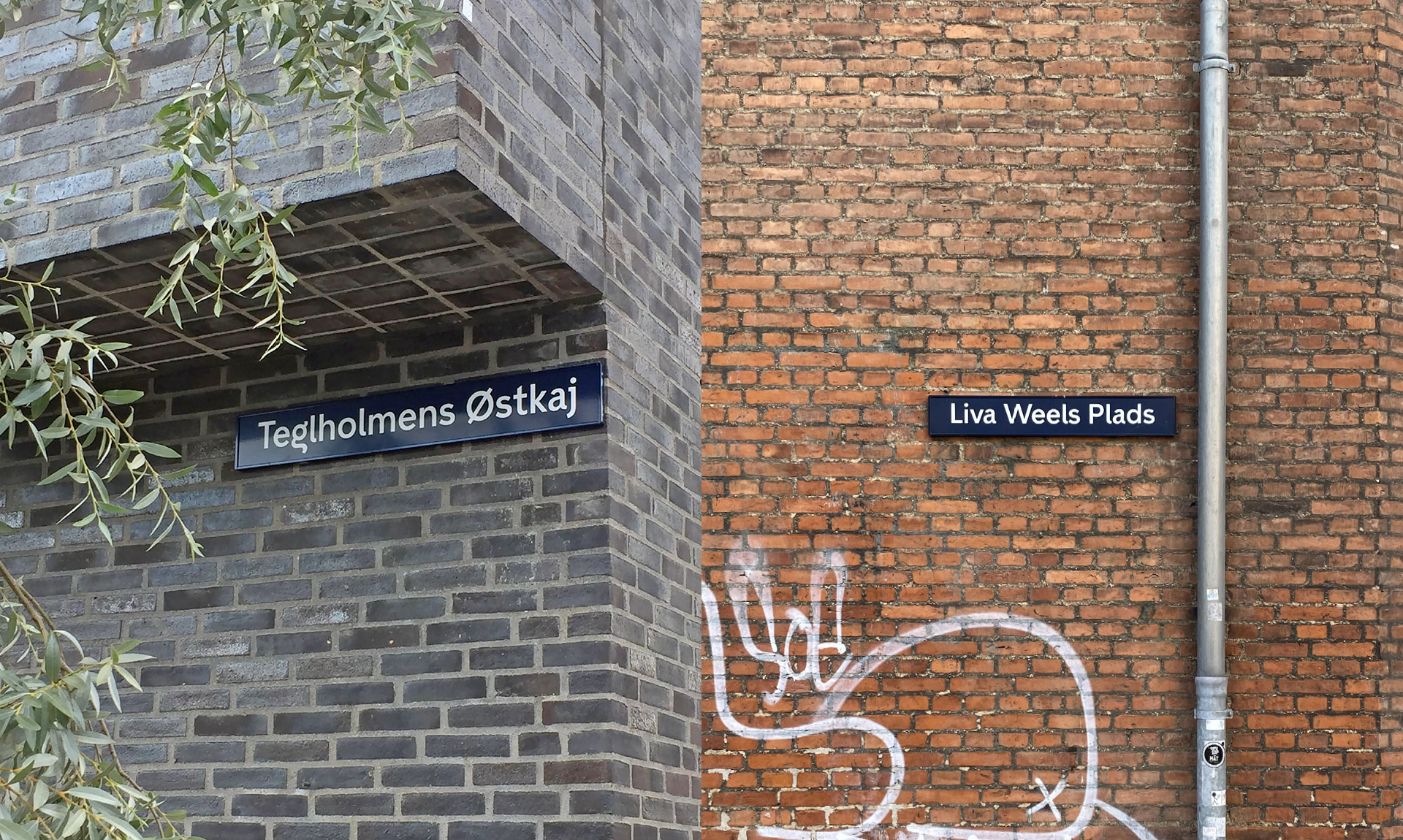
Font name: KBH Sans
Client: City of Copenhagen
Agency: e-Types
Year: 2018
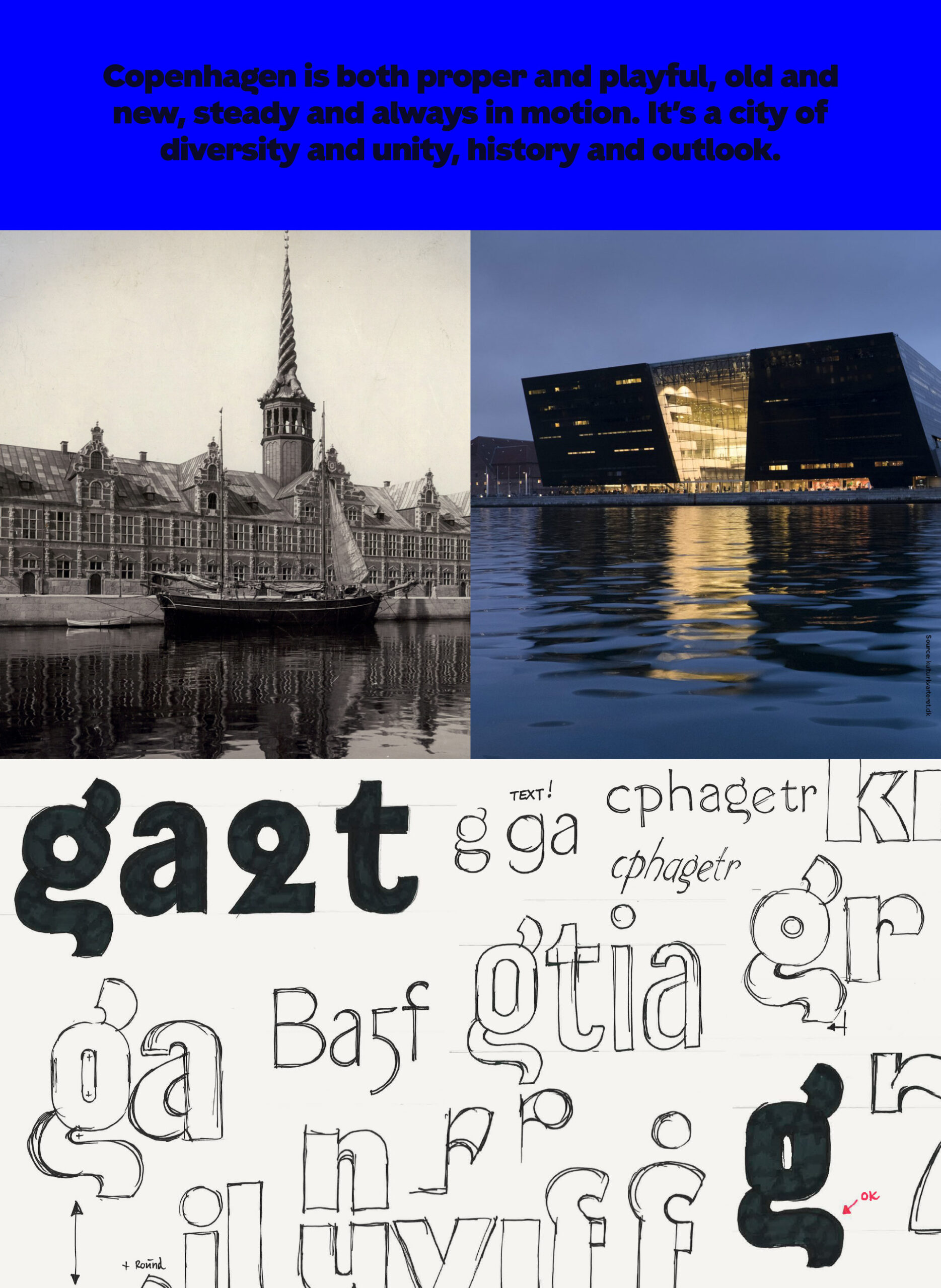
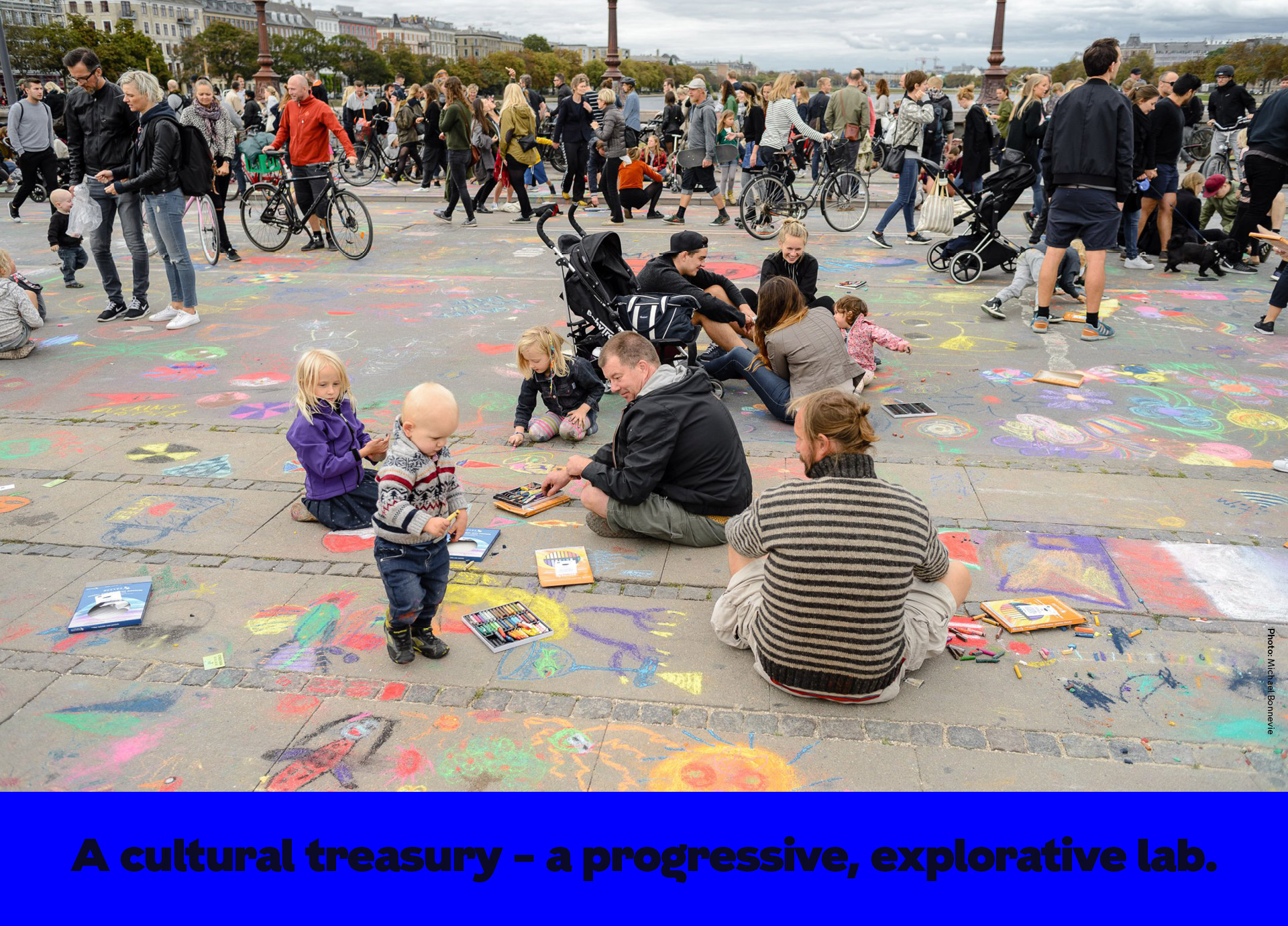
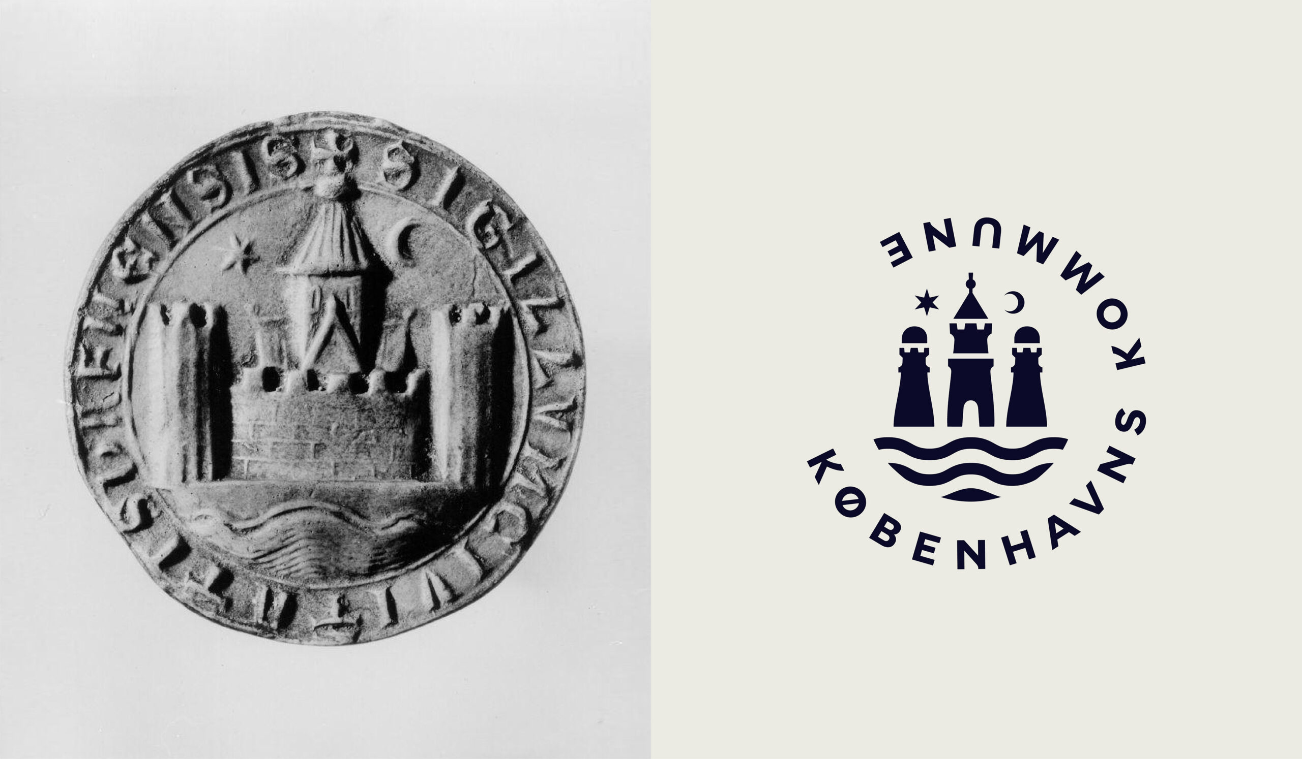
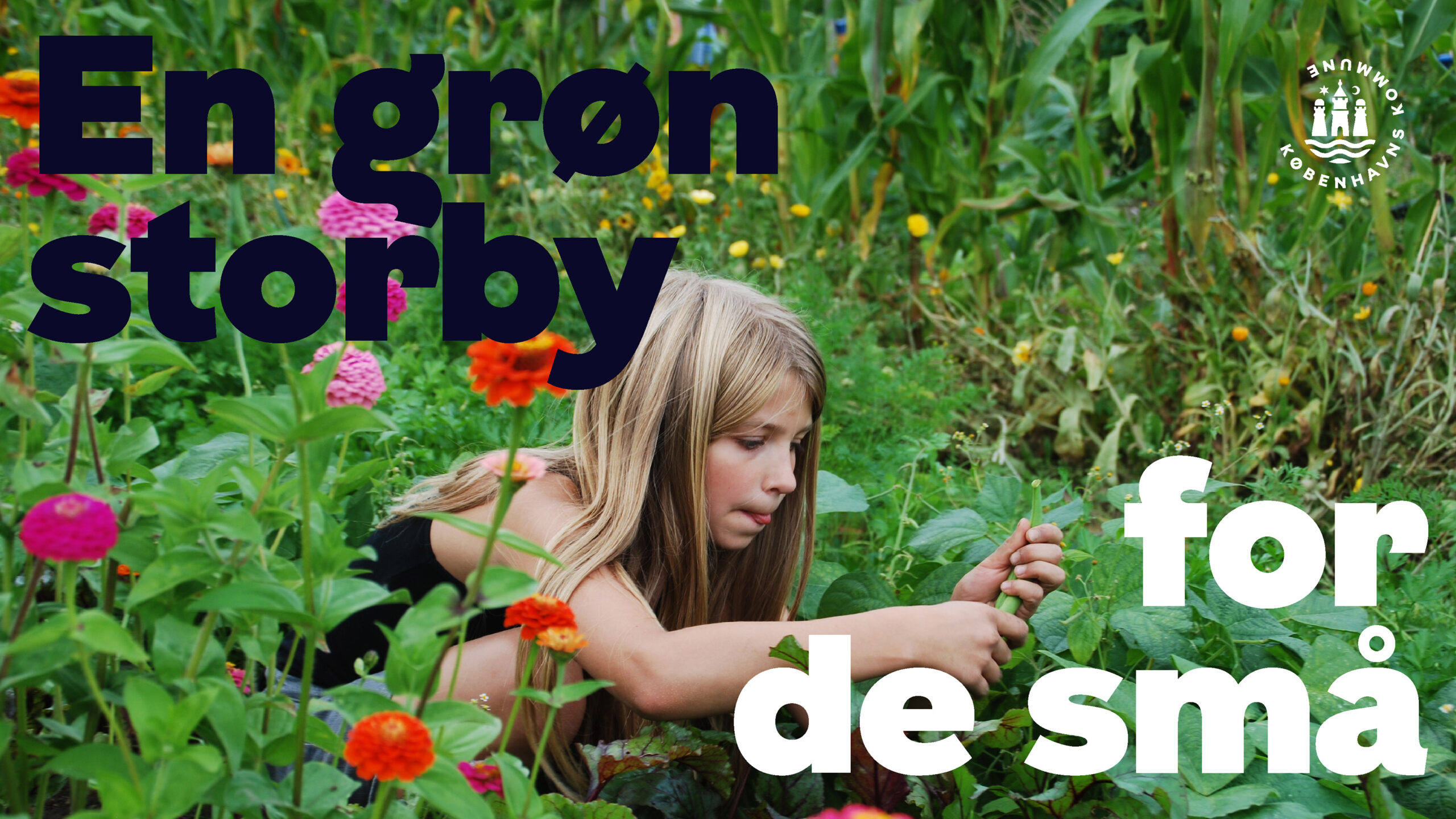
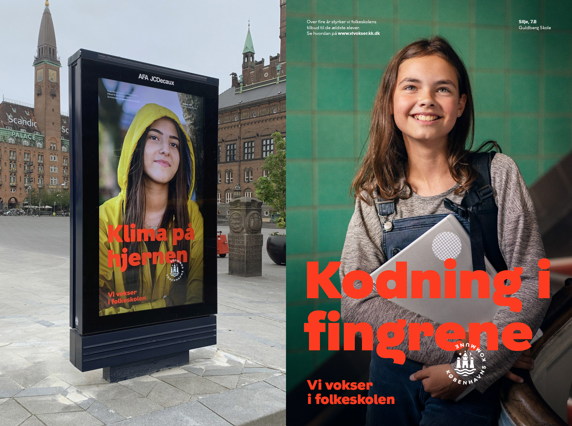
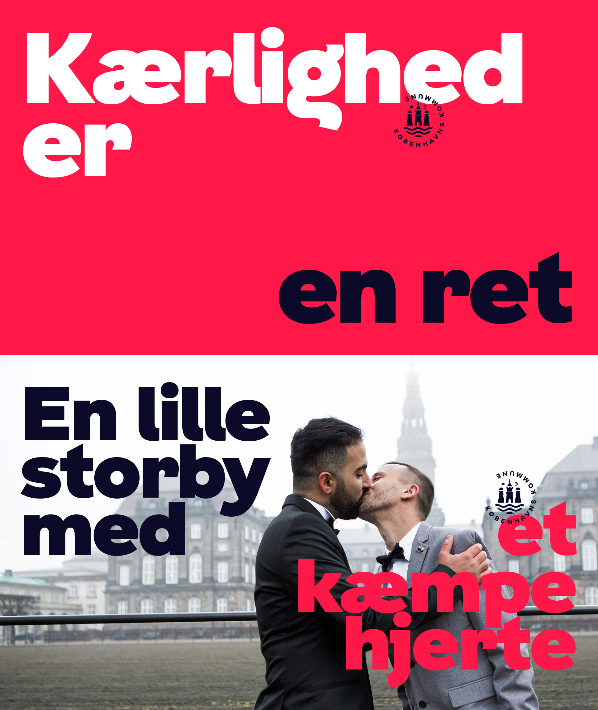
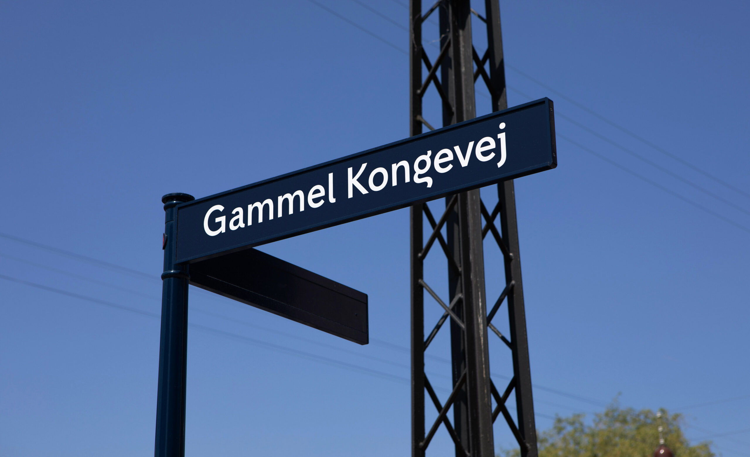
Copenhagen is both proper and playful, old and new, steady and always in motion. It’s a city of diversity and unity, history and outlook. A cultural treasury – a progressive, explorative lab. KBH Sans is a typeface developed for the city of Copenhagen, taking inspiration from both the historical Art Nouveau curves as well as more modern, minimalistic and accessible lines – the same duality that characterises the city. It's used on large scale billboards but also on documents and posters by the municipality, and on street signage around Copenhagen. It has become the city's own typographical voice. e-Types created the visual identity for the municipality, including a rounded, open and flexible logo – reflecting both the dynamics and the balance of the city.