Font name: JAJU
Client: JAJU
Agency: e-Types
Year: 2019
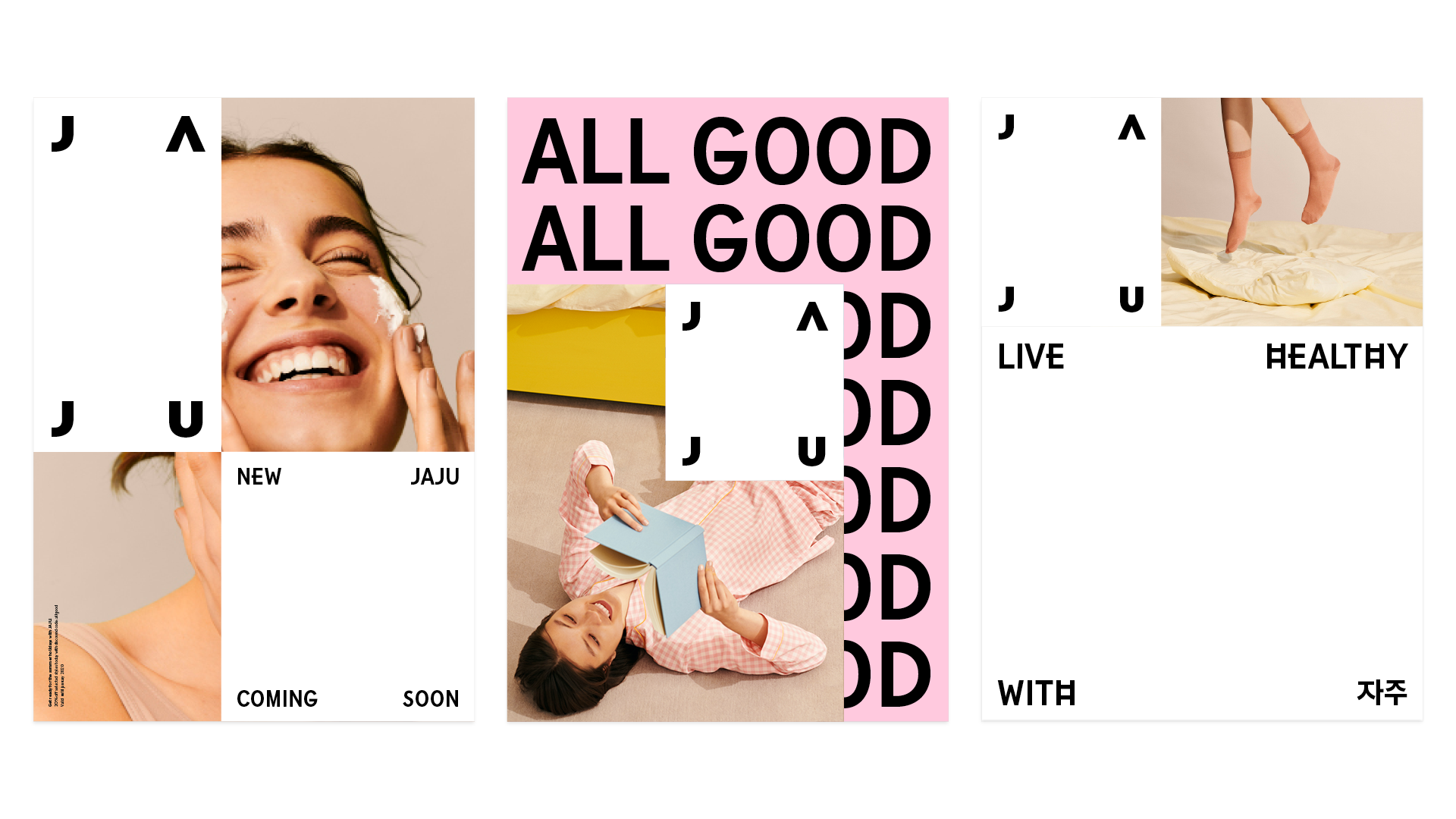
As a pioneer lifestyle brand in Korea, JAJU has since its beginnings in 1999 grown into one of the most well-known and popular suppliers of all-encompassing lifestyle goods in the country with over 165 stores spread across the nation. Going into 2020 with new strategic ambitions and a desire to find new growth engines to reinforce their position in the lifestyle market, JAJU wanted to refresh the brand from scratch – creating a renewed consumer connection on all levels and on all brand platforms; from the brand identity, to retail format to digital presence and beyond.
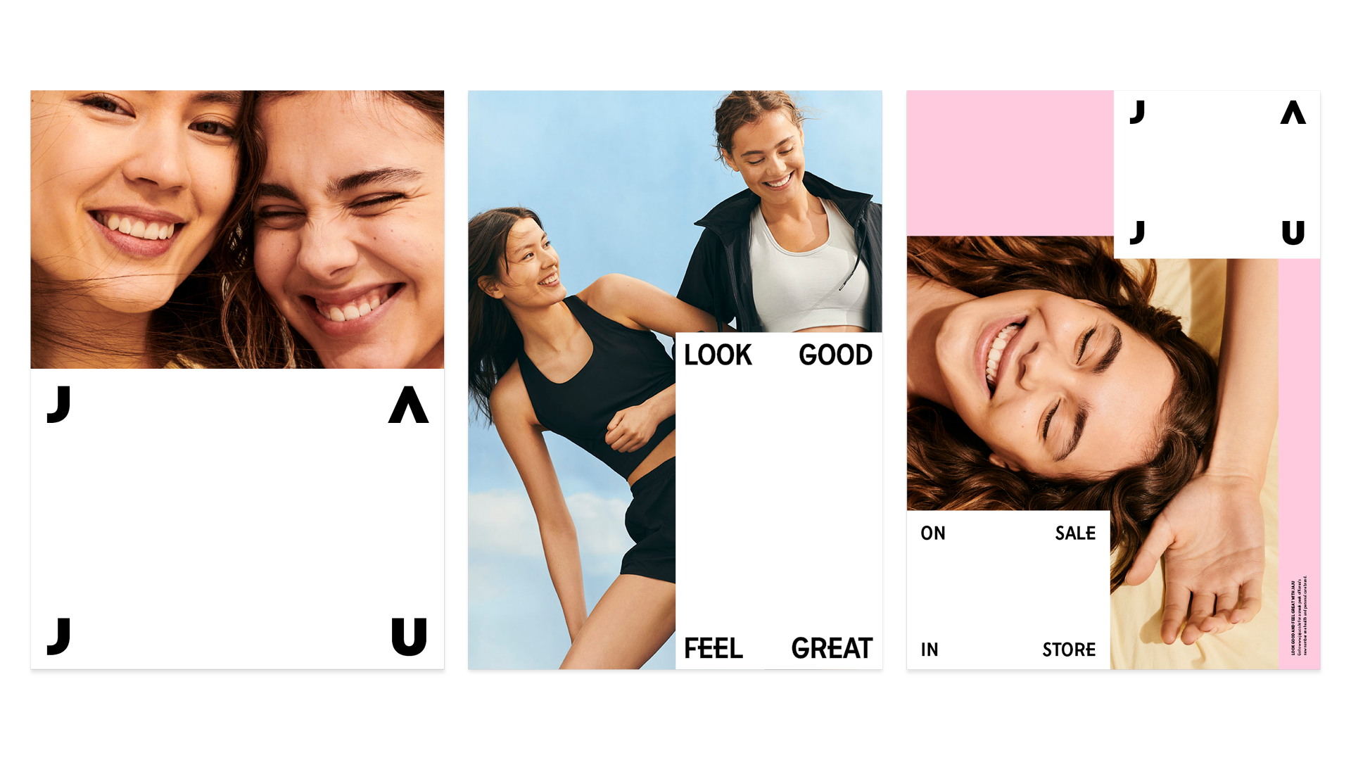
Under the creative concept ‘All Good’, JAJU’s new brand identity is a well-rounded reflection of true Korean simplicity and uplifting, energetic youth culture. Building on references originating within traditional Korean visual language – such as the iconic Taegukgi flag and the classic ogansaek colour palette – the new brand identity features elements that with a contemporary twist lets JAJU’s proud Seoul heritage shine through.
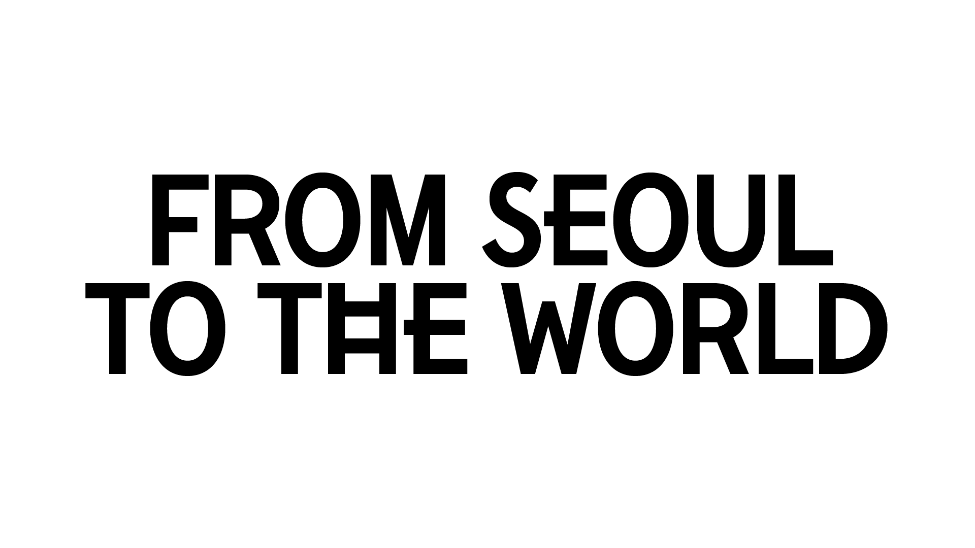
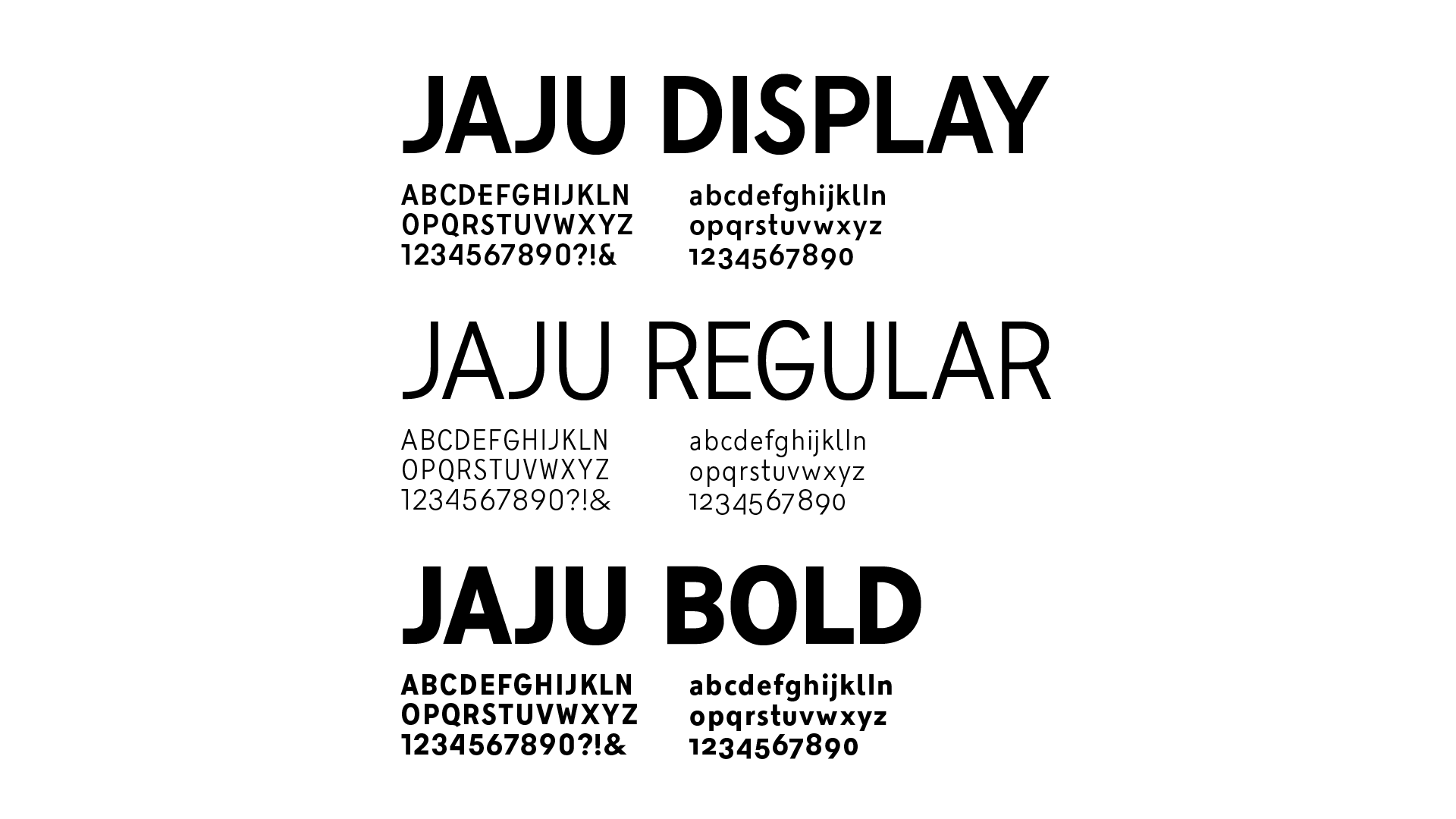
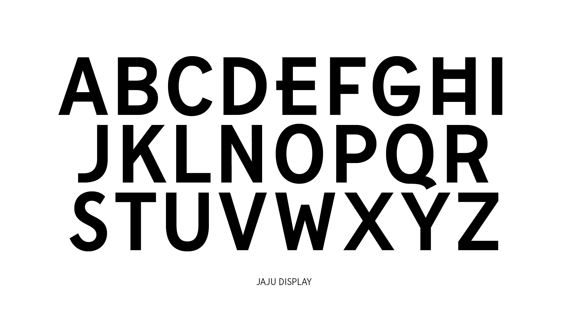
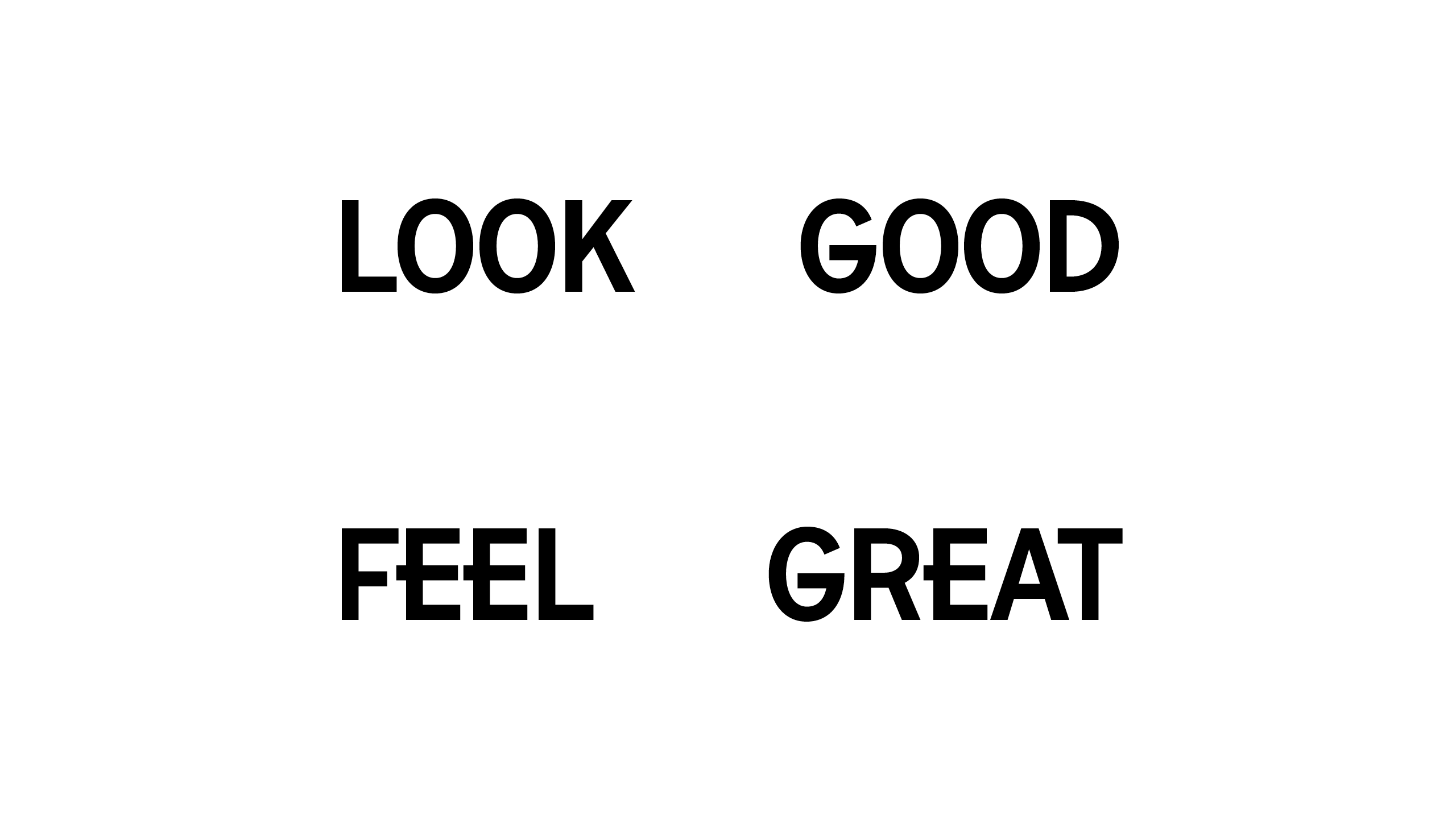
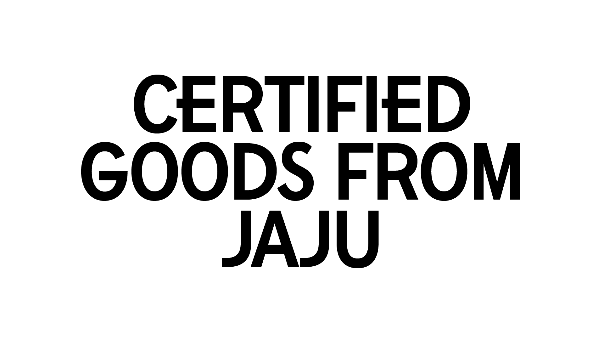
The identity made by e-Types features a bespoke typeface that has been inspired by the label design - integrating its square shape into the anatomy of some of the letters. The result is a contemporary Sans-Serif featuring moments of quirkiness, seen particularly within the letters ‘H’ and ‘E’, which mimic both the white label design and replicates the custom furniture units seen throughout JAJU’s global retail concept, creating a holistic and uniform brand experience down to the very last details.