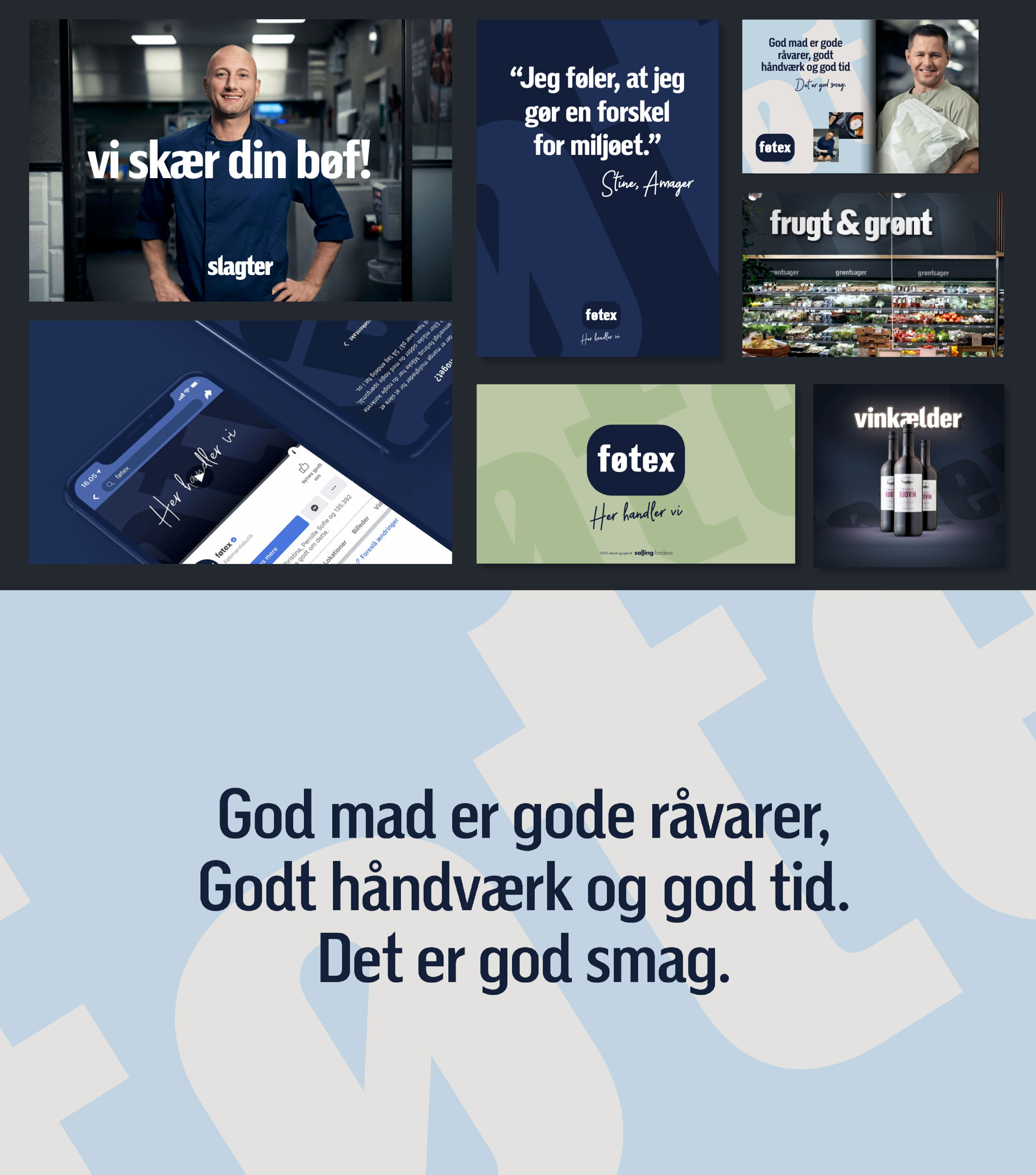
Font name: Føtext
Client: Føtex
Agency: Wibroe, Duckert & Partners
Year: 2021
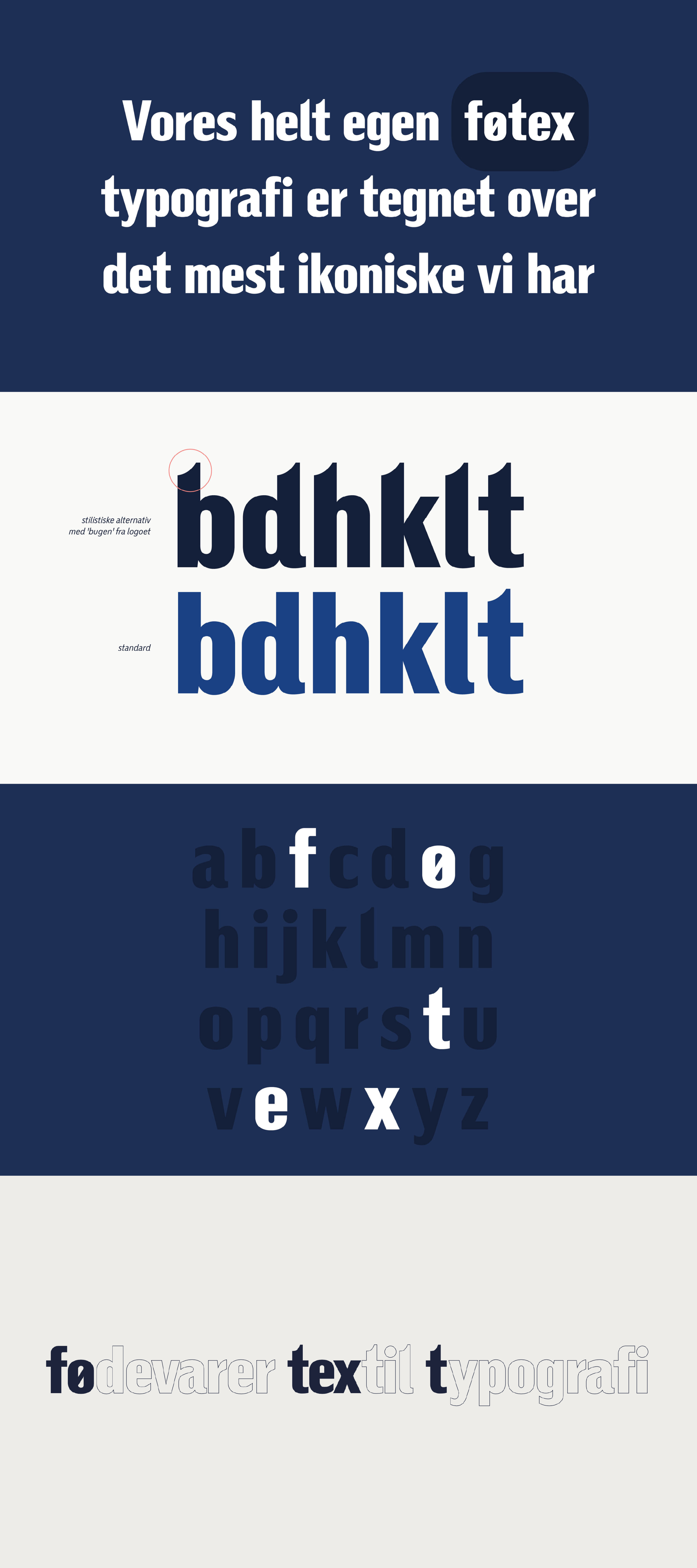
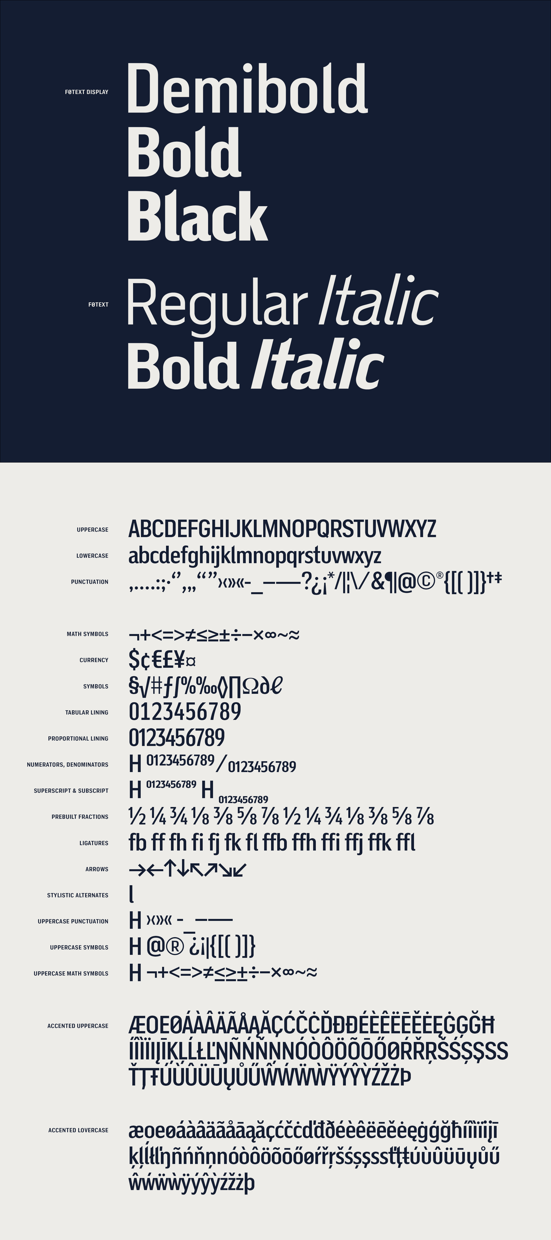
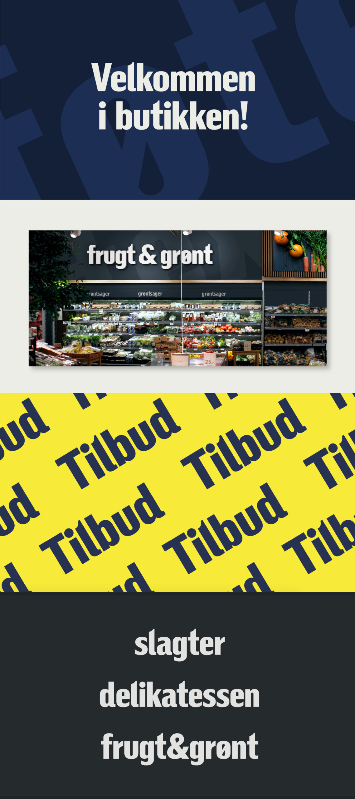
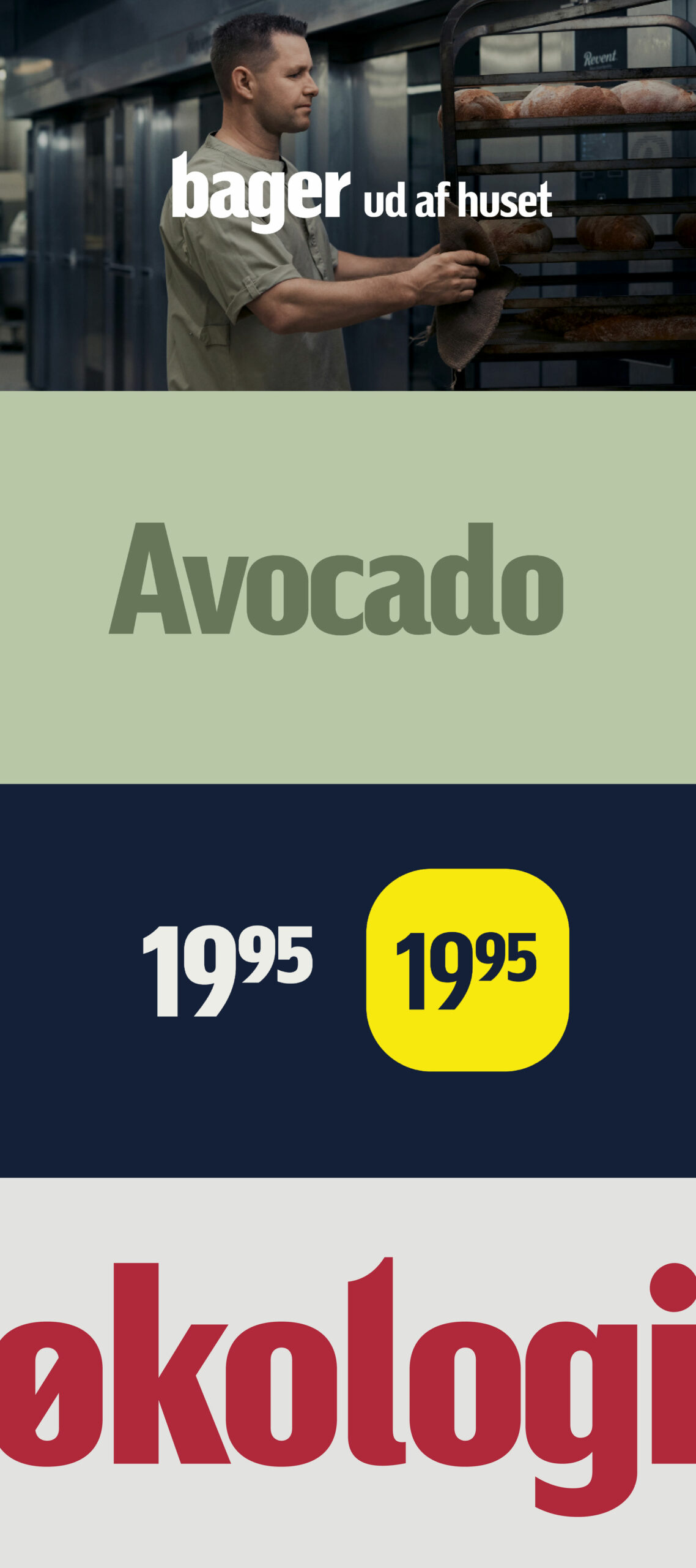
New bespoke typography developed for Danish supermarked chain 'Føtex'. The new typography evolved around the typographic details in the iconic Føtex logo from the 1960s. Its geometric and 'boxed' expression has been translated into a fully functional and legible typeface named 'Føtext'. Transforming the characteristic details from the letters 'f ø t e x' into the new typeface called 'Føtext'. The objective was to establish a more distinctive brand presence for Føtex throughout all their design and marketing by applying more consistency.
